


Archive for the 'Art' Category
Artwork: Fair Winds
One of my latest personal projects is a grayscale piece featuring an impressionistic schooner gliding with the wind across a glassy sea. Three seagulls have caught the same burst of wind.
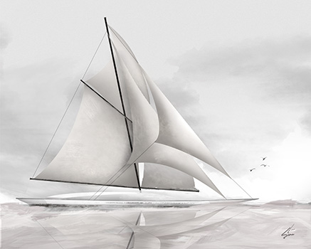
It is available for purchase in my Etsy Shop.
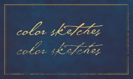
Sketch Style Color Architectural Elevations
I am working on an architectural presentation, where the artwork must show a streetscape of all of the home concepts as well as an individual rendering of each design.
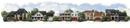
The style: add color, digitally, in a way that still has a similar feel to traditional sketch and watercolor art. Placing detailed sketches on their own layer with blending mode set to multiply, color is built up underneath to add tint, texture, and shadow.
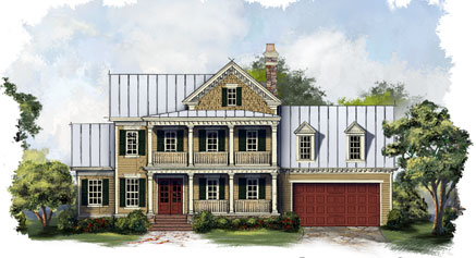
Once each individual design is rendered, they are grouped onto one sheet to create the final street scape. Landscaping, foreground, and sky are painted freehand on the composite to maintain continuity across all designs.
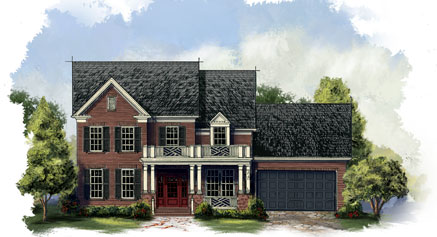
The final individual shots are cropped back out of the streetscape, and a hand painted vignette adds the finishing touch.
Artwork of Amenity Concept, Pool Water
A great summer project. This pool and amenity area concept will add a lot of character to a new residential development.
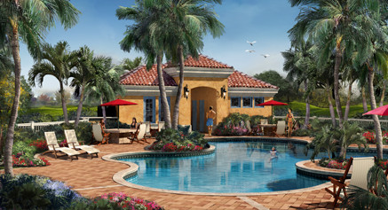
It is important when rendering a swimming pool to create something under the water as well as what is above. I painted some pool steps, tiles and some shadow to represent the pool itself. The water is a layer over top of that with some water waves and refractions with the opacity reduced. Then on top, I inverted the building and plants with the opacity really reduced to help create a reflection in the water. The reflection really helps to define the surface of the water and establish the pool as an integral part of the artwork.
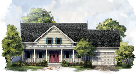
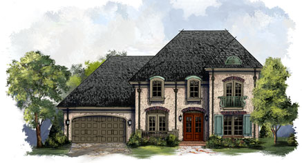
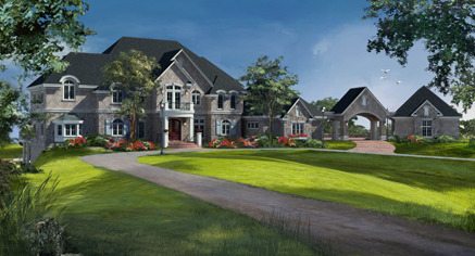
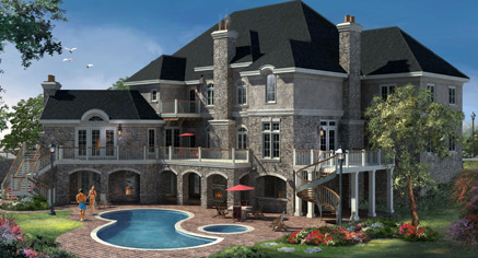
Concept Renderings for a Large Home
Here are a couple of renderings of one of my current projects. This house is almost 18,000 square feet.
The Schooner
Summertime is here, warm ocean breezes, feet in the sand. Get inspired by the beauty around you.
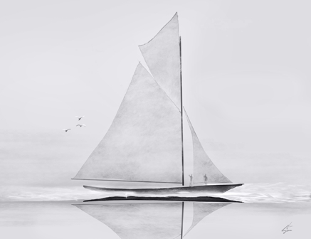
I live right near the ocean where sailboats silently glide on the waves, powered by nothing but ocean breezes. Sailing creates a sense of freedom like none other. Thus inspired, I painted The Schooner. Prints are available for purchase in my Etsy shop. Sail On.
Banjo, Music, and Art
Music has always been an important part of my life. Playing music seems to be a part of my family. My dad, uncles, brothers, sons, nephews all play guitar. I remember taking my first guitar lesson when I was about six years old, and later I played in a band throughout high school and college.
Some of my best memories, however, were the improv jam sessions my family would have on sunny Saturday afternoons on my Grandfather’s back porch. The music was all acoustic, typically bluegrass, which was a big departure from the good old rock n roll I normally played. My Dad and my uncle were amazing musicians and kind of led the song direction.
One day my Dad came home with a beat up old banjo, and with a big grin, handed it to me. I just returned his gaze with a quizzical look, and he just said “For Saturday!” I lived with that banjo for a week to learn a passable Foggy Mountain Breakdown. The back porch jam session arrived, and I surprised everyone with the banjo, and we played a rousing verse of what I had learned. Upon reaching the end of the tune, my uncle excitedly asked “What else do you know?” I replied “That’s it!” I think we played the same song for four straight hours, but man, we had a day to remember.

Afterwards, that banjo went into storage, and was forgotten. But over the years, I always wanted to learn the banjo, and about a year and a half ago I bought a new one. I have had a lot of fun learning to play, so much so, that I decided to feature a banjo in a painting. The banjo in the painting is a creation from my own imagination. The artwork is a mixture of my love for music, the banjo, and creating art.
“The Banjo” is available as various sized prints in my Etsy shop.
Creating Distressed Typography
Creating a distressed look to type, or any other element, is a relatively simple exercise. It can, however, really help develop a rustic or weathered theme for your project. First create the element to which you wish to apply the effect. In this case I will demonstrate on the ColorSketches logo and a simple border around the image.
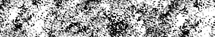
Next create a texture. This will provide the effect, the design can vary, different patterns will create different distressed effects. I have created the stipple pattern shown below. Once you have the texture the way you want it, use the selection tool to place a rectangle around the texture. Then save it as a pattern with Edit | Define Pattern…
The last step is to add a layer mask to the layer which contains the element to which you want to add the effect. In the layers palette, make sure you click on the mask icon that appears net to the layers name. Create a selection around the element and fill with the pattern you just created. You can see an example in the graphic above. The top logo is before the effect, and the lower logo has the mask applied. I have also applied the same procedure to the lower and right side portions of the border. Have fun experimenting by filling with different patterns, you can achieve any number of interesting effects.
Painting the Vintage Santa Claus
It is hard to believe a whole year has passed since my last holiday tutorial on creating a stylized and shiny Christmas Tree in Photoshop. For this year, I have had some with a Santa Claus carrying his magical bag of toys.

Before starting to paint Santa, I did a little research on how artists have been portraying Santa. Unsurprisingly his appearance has evolved over the years, becoming ever more contemporary looking. Attracted to the Santa persona of years passed, I decided to make this one more of a vintage Santa Claus. I roughed in a sketch, creating a shorter, rounder Claus holding a very, very large bag of toys. To fill the color palette, I decided to use the colors of vintage Santa artwork circa 1900 to 1930. The reds and greens from that time period are very distinctive. The beard and fur colors have a definite yellowish tint, which not only “age” the vintage Santa, but adds a little warmth. The environment seems to be lit by the warm glow of a late night fire. Hope this gives you some ideas if you want to have some fun with holiday artwork of your own. Have a very Merry Christmas and a Happy New Year!
Santa is available in my shops on Etsy and Artfire.
Power of the Rendered Plan
I recently created a set of architectural illustrations for a multifamily residential project. They represented various aspects of the rather large development. Among the goals the builder wanted to accomplish on this Italian style design were some marketing concepts of the rear courtyards on the townhomes.
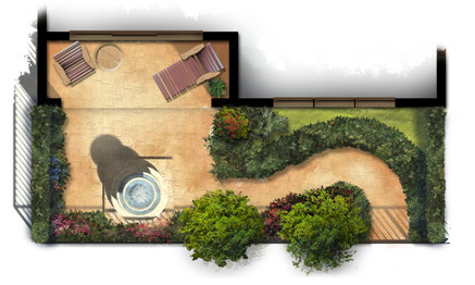
Small and simple, the plans reflect the way the outdoor courtyard spaces become part of each home’s living space. Each provides a fountain and sitting area with some low maintenance landscaping for aesthetics as well as privacy.
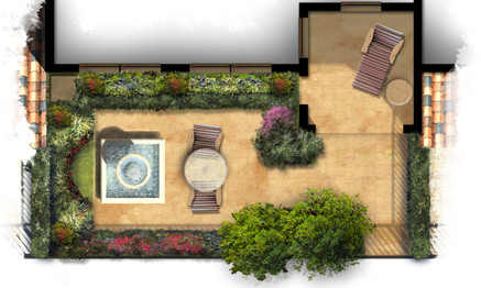
The artwork itself was created freehand in Photoshop using a variety of natural brushes. The landscaping plants themselves are loose and representational but suggest the colors and masses of possible garden ideas. The colors are bold and were carefully chosen to provide an eye catching marketing graphic for print as well as web presentation.
The Spirit of Halloween
There are several holidays that bring out the creative side in everyone. Halloween seems to be one of them. There is something about Halloween that fuels the imagination.

Catching the spirit, this art piece emerged from my imagination as a mixture of Halloween and the Fall season. It is available in my shops on Etsy and Artfire.
Rendering Architectural Elevations
I have created thousands of architectural illustrations, but in each and every one, I try to develop a new technique, explore new ways of using color, or learn something new. This not only keeps the work fresh and interesting, it allows me to grow as an artist and designer.

Creating a ragged edge around the rendered elevation is a technique I use frequently. At first glance it seems simple, but I spend more time on this than you might think. In effect, it creates a negative space in the artwork. Applied carefully, it will create balance, develop focal points, and enhance the motion in the piece.

Blobs of people shaped objects create life and activity while suggesting the scale of the architecture. The lack of detail keeps the focus on the architecture and not on specific characteristics of the people.

Framing a focal point with foreground landscaping will define the artwork’s motion and draw the visitors eye to the main architectural feature. The splash of color in the flowers create a sense of elegance while developing a contrast with the rustic stone.

Depth can be created with lighter colors in the background trees, this is a well known technique. It can also add depth in the foreground, visible in the walkway as it extends towards the viewer. Keep painting and enjoy the experience of trying something new each and every time!
Lighthouses and Artistic Expression
Recently I have been thinking about pursuing some of my own projects. I have on occasion done some quick sketches or abstract pieces to express myself as an artist, but I have not really presented them to public. Even though my main focus remains on commissioned work, I am going to be creating some other work, and making it available online. I have opened a shop on Etsy and another on Artfire.

One focus I am going to be exploring is a series on lighthouses. Lighthouses are an icon of our maritime past. They are unique in design, and the settings are always majestic. To that end, here are a couple of shots, above is the whole work and below is a closeup.

Another piece created for the shop is this humpback whale swimming leisurely through the sea. You can visit him at my Etsy shop here.


