


Archive for July, 2009
Photoshop Layer Merge
This Photoshop tip is very short and very simple. To merge any layers together, select them in the layers palette. Then press ctrl-e. They will all merge into one layer. It does not sound like much, but it is one of the biggest time savers, and I use it constantly.
Photoshop Sharpening Technique
As you probably know, the standard way of sharpening an image in Adobe Photoshop is to use the Unsharp Mask filter. (I have always loved the fact that you use the unsharp filter to sharpen things.) There is, however, an alternative sharpening method that allows a lot of versatility even after you have run the filter. Here is how it works.
Make a copy of the image by putting it on to a duplicate layer. Set the duplicate layer’s blending mode to overlay, and then run the high pass filter. It can be found under Filter|Other|High Pass. Adjust the slider to control the strength of the effect. Press ok to accept. That is it! But, now you have even more possibilities.
You can decrease the amount of the effect by reducing the opacity of the layer. You can also limit the effect to certain areas by adding a layer mask. Painting the layer mask with white reveals the full effect, painting with black removes the effect, and painting with 50% gray will decrease the effect by 50%. This way you can vary the effect of the filter in different parts of the image.
Mastering Color Schemes in Photoshop
Photoshop must be transparent. If you are thinking about how to do something in Photoshop, you cannot possibly concentrate on your work. One of the best ways to conquer the monster is to reduce the number of steps needed to accomplish a goal, and see immediate results on your screen. Here is one quick tip that keeps my creative flow at full speed.
You are working on a design graphic. You want to see a lot of color schemes quickly. Create a layer for each color element. Fill the element with any color, and it is now time to experiment. Instead of refilling with a new color or gradient, create a color or gradient style on the layer. You can now cycle through your swatches or gradient library at lightning speed, and immediately see the color changes in the element.
To try different color combinations, nondestructively, duplicate elements (layers) and flip through your colors again. If you decide you like the original choice better, delete the new layer, the old one is still underneath. If you think a color half way in between might look nice, reduce the opacity of the top layer to mix it with the color below. Still not quite right? Cycle through blending modes, and get even more variations.
Alternate Level Up in Photoshop
When it comes to very basic color correction in Photoshop, the simplest is setting the dark point and light point using the levels command. Photoshop has a helpful feature that gives you more visual feedback when running the adjustment. While clicking on the dark or light point sliders, hold down the Alt key. The image will turn solid white or black and the nearest tonal values will appear as dots on the screen. As a rule of thumb, the proper adjustment is when the first pixels begin to appear.
This method will also work when adjusting color values. Select each color channel individually when running the adjustment. This will adjust not only the contrast, but correct colors as well. The Alt key shortcut will work in each color channel just like it does on the combined channels.
Creating Artwork: A Different Approach
I would like to preface this by saying each artist should do what works for them, and believe me, I have certain patterns I stick to when working on a new piece. I have lately realized, however, that some of my patterns have changed over the years. Years ago, I would sketch out my concept and then, basically, illustrate the sketch. After working digitally for quite a while now, I have to admit, I have not sketched an idea in a very long time.
Between the power of layers, and the ability to manipulate shapes by scaling, rotating, warping, and other fun techniques, I have developed a whole new approach. Starting with basic constructs, I will mass out shapes, twisting and pulling the masses until I am happy with the composition. I will then start to work in details, using lots of layers, to complete the piece. As new details, colors, and thoughts are introduced, I will refine the relationships to maintain the original tension and balance of the composition.
By taking this approach, the artwork will grow and change as the process takes place, allowing for one, fast paced, creative flow from beginning to end. The final work may look just like the initial concept, or it may be something completely different.
The most difficult part of this method is knowing when to stop. By saving progress steps along the way, if you find you have engaged the piece a little too much, you can revert back to a simpler version of the work. I know, for some of you, abandoning that initial sketch is a very difficult thing to ask. Give this method a try. You may take yourself on a wild creative ride, and find a side to your creativity you never knew existed.
Rapid Shading in Photoshop
Realistic shading in Photoshop does not have to take a lot of time. To illustrate, we are going to shade a simple sphere in thirty seconds or less.
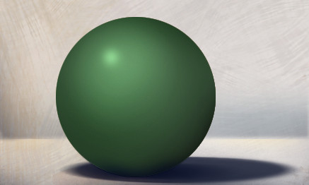
Create a circular selection and a layer to begin the process. Choose a base color for your sphere, then fill the selection. In the layers palette, duplicate the layer by dragging the layer name onto the “Create New Layer” icon. Click on you foreground color to call up the Color Picker, select the “Brightness” button and drag the slider downward to get a darker version of the same color.
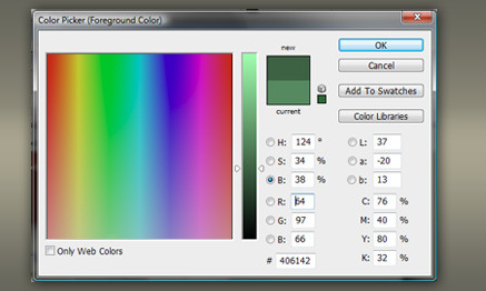
Fill the duplicated layer with the darker color, then with a soft edged brush, erase part of this layer. This will reveal the lighter color underneath, and voila, you have created your shadow. Calling up the color picker again, drag the slider upwards to create a lighter version of the original color. On a new layer, tap the sphere with a soft edged paintbrush to create the area where the light is striking the sphere. Calling up the color picker again, drag the slider upwards to create a very light, almost white, version of the original color. On a new layer, tap the sphere with a small paintbrush to create the specular highlight. You now have a three dimensional looking sphere.
This is a very simple example of the technique, but the same process can be applied to even a very complex shape.


