


Archive for the 'Design' Category
Entry Feature Design
I was recently asked to create a concept for an entry feature for a new residential development. The requested parameters were waterfalls, stone, and bronze deer splashing through the water.
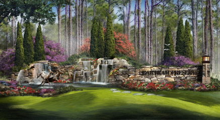
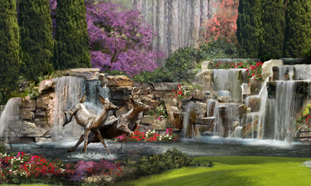
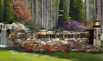
The concept I created is represented in this artwork. As the landscape behind the feature is heavily wooded, I made free form curved walls out of stone to provide a rustic texture to blend with the environment. The waterfalls provide a backdrop for the deer, and flowering trees and shrubs provide bursts of color.
Site Concept Artwork for Builders and Architects
A great concept can win a project or get a project quickly approved. Presenting that concept in an inspiring manner and telling the story in a clear concise way will assist in both instances.
I do a lot of site concepts, for builders as well as architects. I have found that bright colors, plenty of landscaping, and an artistic feel create the best solution. Contrasting colors will easily distinguish pathways and pedestrian areas, while low contrast colors between the parking and landscape help reduce the visual intrusion of the hardscape.
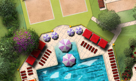
The whole artwork can be created in Photoshop using the cad file as the base. Converting the cad file to an eps allows for easy import and maintains thin, precise lines that do not intrude into the graphic. A combination of fills and freehand painting within Photoshop bring the concept to life. In addition to approvals and presentation, the rendered site plan is a very effective marketing tool when included in marketing materials like brochures and websites. Printed in a large poster size format, it serves as a great tool in the sales center.
Concept Design Level of Detail
Concept artwork can serve a variety of purposes, and it is important to provide the level of detail that will accomplish the overall goals. In some cases an elevation with just enough detail to illustrate the design is all that is needed.

This type of illustration can be created in a shorter time frame, and with some color and texture, it can establish the mood or feeling of the intended design. If the final objective is to delineate exact features of the project, a more detailed concept may better accomplish your goal.

This final result can create quite an impact. The artwork, however, takes longer to develop, and because of the level of detail, the design must be much more complete. Either one is very valuable when developing a concept, and selling the design to the parties involved.
Instruments for Wild Acoustic Music Co.
Many of you know me as an artist and a designer, but you may not know about my love for music. I have been a musician for most of my life, and have always enjoyed playing music, talking about music, and having fun with other musicians. I have also found a lot of enjoyment in introducing the art of playing music to people who are just beginning to play or have always wanted to play. In support of these experiences, a while back I founded a music company called Wild Acoustic.

The Wild Acoustic Music Co. represents many name brands of course, but there is a twist that makes it really exciting: many of the instruments are hand made by various luthiers and craftsmen. Over the years, I have had the wonderful opportunity to meet and become friends with many of these artisans, and it is very exciting to represent their magical instruments and introduce them to a wider audience.
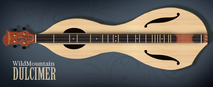
In addition to supporting these wonderful artists, I also design instruments for Wild Acoustic, and our workshop makes these instruments, but I have also established a wonderful friendship and working arrangement with a fabulous artisan named Jon Norris. He is the founder and genius behind Jon Norris Music and Arts. He applies his experience and talents to some of the more difficult to make instruments.
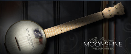
Pictured here are two of the new Wild Acoustic instruments. They are the Wild Mountain Dulcimer and the Moonshine Ukulele. I designed them using, none other than, Photoshop. It is a great tool with which to work as it allows freehand but controlled creation of the curves, and allows experimentation with materials and colors as part of the design.
You can explore the many fabulous musical instruments and see the new Wild Acoustic instruments online at WildAcoustic.com.
Concept Design Presentation
When presenting concept designs, a little context goes a long way. When working on several candle concepts for an international candle company, I created some virtual sets so the decision makers could see the designs in the way their customers would see them.

One of the categories, seasonal candles, included some Halloween candles. A cozy front porch is the perfect place to display them. I quickly created a 3d front porch and rendered it with the jack-o-lantern candle concepts glowing on the front steps.

Another quick 3d model provided a warm place to display some tabletop candle holders. The background painting was a quick, colorful sketch painted freehand in Photoshop.
Making the Most of Gradients
When large areas of empty space enter your layout, a simple gradient can be much more effective than just a solid color. As you see below, a subtle gradient added to these simple colors can add quite a bit of interest.

To arrive at just the right gradient, try applying the gradient as a layer effect. This will allow you to test different colors and tweak the ramp very quickly. When you arrive at one you like, but want to try another, copy the layer and adjust the new one. This keeps the old option intact, should you want to go back to it. Save your favorite gradients or save the layer effect for future designs.
Symmetry, Simplicity, Art, Design
Alone, iconic, and symmetrical, the design calls for a landscape feature at the center of a round about. As it will be seen from all sides, it must be the same on all sides. Themed and representative, the style must accentuate the identity while not being obtrusive. It must be highly visible while not blocking any views. The design answer is symmetrical and simple.

Like the design, the illustration portrays the same simplicity. Only a hint of background and a grass line foreground, suggest the environment but do not detract from the focus. The spray and fall of water provide compositional balance between the landscape’s features. The color palette is simple and light so as not to be a part of the design presentation.
When the design question calls for a simple answer, keep it simple. When the design is simple, quiet elegant artwork will keep the focus where it belongs: on the design. Symmetry between design and the representational artwork is a very, very effective strategy.
Illustrating an Isolated Subject
When designing and illustrating an isolated subject, it is not necessary, and possibly distracting to render the surrounding area. Simply suggesting a background and foreground can really make the subject stand out.

Abstractly edging the illustration, creating a vignette, can further simplify the graphic. The sketched white overlay on the background and side landscaping saved a lot of rendering time as well as creating a unique border around the subject.
The Art of Technical Illustration
When working in conceptual art, a project sometimes requires the design to be represented as a nice piece of artwork. Sometimes, however, the message needs to be communicated in a more detailed, technical illustration. A technical illustration can still be a lot of fun, and it can also be an attractive graphic.

This particular illustration represents the design of a littoral shelf, which is the intersection of a man made body of water and the land. The area is landscaped with a variety of plant species, each serving a particular purpose in the sustainability of the shoreline.
CSS, Fun, and Modern Browsers
Even though my business offers different services: concept design, art & illustration, and web design – it seems incoming projects will undoubtedly be for the same service at any particular time. For the last couple of months almost everything has been web design.
Thus, web design is on my mind right now. One of the projects on which I have been working, is a redesign of my blog and resource Art & Architecture. Since it is a project for myself, I have decided to design it for a minimum screen resolution of 1024 pixels wide. It looks better on a 1280×1024 resolution, and even better on the 1920×1200 resolution running on my monitor. I have taken some time to play with enhancements using the Spry Framework in Adobe Dreamweaver. I have also been messing around with jQuery. Both offer some very cool possibilities.
The content for all current projects is database driven with structural html markup, and styled with css; no tables. I have been improving my web programming skills by dropping hard earned money on reference books, and doing lots of research on the web, and one thing confuses me a little. I vowed to keep everything positive on this blog, but a little rant here, the “expert” programmers writing these references spend a lot of time talking about designing for people with ultra low res monitors, and how to create work-arounds for people using ten year old outdated browsers. The first thought that comes to my mind, why is anyone using Internet Explorer 5 for Mac? There are any number of browsers available, and they are all FREE!
So I have been testing my code on current browsers: Firefox, Safari, Opera, Flock, Avant, Maxthon, SeaMonkey, Chrome, and Internet Explorer 6, 7, 8. (If you are not using a current browser, here is your opportunity.) As I can only have one version of Internet Explorer on my system at one time, I use IE Tester for testing Explorer. Second rant for this post, as I write the code (as the “experts” instruct me), my pages work perfectly in everything except Internet Explorer 6, 7, 8. So the second stage of every page design seems to be butchering the code three different ways to get it to work in each of the three Microsoft products. And they write our operating system! Microsoft! Learn how to write a browser and quit holding back the web!
Enough said: I must dive back into a reference book and find a hack to make today’s web page work in Internet Explorer. Yeeha!
Watercolors by Winslow Homer
An inspiring book – Watercolors by Winslow Homer: The Color of Light – written by Martha Tedeschi with Kristi Dahm, has sent me once again on a new path. The book features many works by the great watercolorist, but more importantly, Homer’s techniques and materials are discussed as they related to each piece.
Of course, my mind began trying to develop digital techniques that would create some of these fantastic styles. Homer’s use of light and composition are also quite intriguing, causing me to rethink some of my own thoughts on highlights and subject relationships.
If you have never seen the works of Winslow Homer, the online National Gallery of Art Exhibition is very well done. The Art Institute of Chicago Exhibition also has very informative resources. You may want to check them out as well as this book, I recommend it highly.
Artwork at Dusk
I have been quite busy lately, producing various kinds of artwork, and even some website work. One project involved a concept and rendering of this small condominium unit.

Here are a couple of larger shots, details in architecture are very important. The additions of light fixtures and other stylized items add a little more realism to the concept.


I set the time of day at dusk just to add a little atmosphere. Used effectively, unusual weather or time of day can create additional mood in an architectural rendering. If you would like to see more of my work, check out my portfolio at www.BlueNoseGopher.com


