


Kuler App for iOS and Creative Cloud
I am still exploring the Adobe Creative Cloud, trying to find all of the ways it can improve my workflow. There is a Kuler app for iPhone that has already proven itself to be a fantastic new tool. Using your iPhone’s camera, the Kuler app will sample colors of whatever it sees and build a Kuler swatch bar. Here are a couple of grabs from the Adobe website.
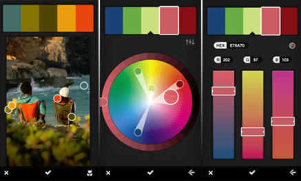
While the camera image is on the screen, it will randomly sample colors. You can also drag the little “dots” to specific colors you see, and it will sample those. Then Kuler has several editing pages that will allow you to modify and tweak the colors until you have exactly what you want. To give the process a try, I went exploring in my front yard. I grabbed a swatch from a Crown of Thorns flower and also the leaves on a Hong Kong Orchid tree. These are the resulting swatches, I did not edit the colors in anyway, these were random Kuler samples.
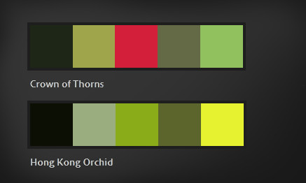
You can then transfer the swatches to the web, where you can access them directly in Photoshop. Each color in the swatch can be sampled or transferred right into your swatches palette. Using only these colors, I quickly sketched two bushes. The one on the left is from the Hong Kong Orchid palette, and the one on the right is from the Crown of Thorns palette.
I see a lot of potential for this app. I am constantly looking for art and design ideas, especially colors, and this is going to work fantastically.
Adobe Kuler Within Photoshop
I recently joined the Adobe Creative Cloud. After watching all of Adobe’s videos on the concept, I thought I would give it a try. The monthly plan is definitely more comfortable than thousands of dollars for an upgrade. Plus I like the idea of always having the most up date versions of the software. The only issue I have had so far has been a couple of crashes in Photoshop. I have been using Photoshop for many years, and it has always been my most reliable tool, so that has really surprised me.
For me, one of the most exciting features is the inclusion of Kuler as part of Photoshop. I have been using the Kuler website for years, and it has become a trusted friend. Having access to it withing Photoshop is incredibly powerful as well as convenient.
To access it, use the menu at the top. Go to Window | Extensions | Kuler. It will pop up as it’s own panel. I actually dragged it to the panel group where my Color Swatches are and docked it. That way it is always readily available. The operation is identical to the Kuler website. It even has a live link to the site to provide easy access to the online libraries of swatches. It is a great tool made even more convenient, a very welcome part of the upgrade.
Creating Distressed Typography
Creating a distressed look to type, or any other element, is a relatively simple exercise. It can, however, really help develop a rustic or weathered theme for your project. First create the element to which you wish to apply the effect. In this case I will demonstrate on the ColorSketches logo and a simple border around the image.

Next create a texture. This will provide the effect, the design can vary, different patterns will create different distressed effects. I have created the stipple pattern shown below. Once you have the texture the way you want it, use the selection tool to place a rectangle around the texture. Then save it as a pattern with Edit | Define Pattern…
The last step is to add a layer mask to the layer which contains the element to which you want to add the effect. In the layers palette, make sure you click on the mask icon that appears net to the layers name. Create a selection around the element and fill with the pattern you just created. You can see an example in the graphic above. The top logo is before the effect, and the lower logo has the mask applied. I have also applied the same procedure to the lower and right side portions of the border. Have fun experimenting by filling with different patterns, you can achieve any number of interesting effects.
Painting the Vintage Santa Claus
It is hard to believe a whole year has passed since my last holiday tutorial on creating a stylized and shiny Christmas Tree in Photoshop. For this year, I have had some with a Santa Claus carrying his magical bag of toys.

Before starting to paint Santa, I did a little research on how artists have been portraying Santa. Unsurprisingly his appearance has evolved over the years, becoming ever more contemporary looking. Attracted to the Santa persona of years passed, I decided to make this one more of a vintage Santa Claus. I roughed in a sketch, creating a shorter, rounder Claus holding a very, very large bag of toys. To fill the color palette, I decided to use the colors of vintage Santa artwork circa 1900 to 1930. The reds and greens from that time period are very distinctive. The beard and fur colors have a definite yellowish tint, which not only “age” the vintage Santa, but adds a little warmth. The environment seems to be lit by the warm glow of a late night fire. Hope this gives you some ideas if you want to have some fun with holiday artwork of your own. Have a very Merry Christmas and a Happy New Year!
Santa is available in my shops on Etsy and Artfire.
Painting the Holiday Tree
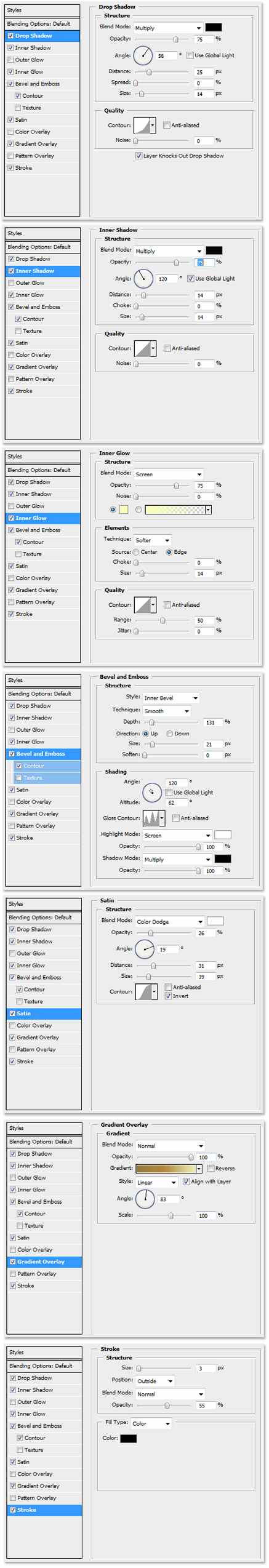
Recently I created a card for one of my clients, and it featured a stylized tree that was hand painted in Photoshop. The tree has an embossed “liquid gold” look, that was made possible by a layer style.

With the layer style applied to the layer before painting the tree, it created the unique feeling of painting with a paintbrush full of very heavy paint. Here are the settings for the layer style.

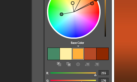
Making the Most of Gradients
When large areas of empty space enter your layout, a simple gradient can be much more effective than just a solid color. As you see below, a subtle gradient added to these simple colors can add quite a bit of interest.

To arrive at just the right gradient, try applying the gradient as a layer effect. This will allow you to test different colors and tweak the ramp very quickly. When you arrive at one you like, but want to try another, copy the layer and adjust the new one. This keeps the old option intact, should you want to go back to it. Save your favorite gradients or save the layer effect for future designs.
Layer Effect Control using Groups
Photoshop Layer Effects are an effective and fast way to enhance your work. Sometimes when editing those layers, the effects do not always behave the way you want. For example, if you erase a section of the layer, the effect adjusts itself to match the new layer shape. This is illustrated in the graphic on the left.

This, however, is not always the way you may want the effect to work. You may want to remove a section of the layer and also obscure the effect as well. There is a very simple solution. Make a new group, and slide the layer you want to edit into it. Create a layer mask and use the eraser on the group instead of the layer. As you can see in the illustration on the right, a section of the layer is removed, but the effect does not adjust to the new layer shape.
Softening Brushes in Photoshop
Here is a quick tip for Adobe Photoshop. When painting with a soft brush, the key combination “Shift-[” will soften the brush on the fly. The combination “Shift-]” will sharpen the edges of the brush. Combining a very soft brush and reducing the flow rate will allow very subtle airbrush painting.
Multiple Layer Masks in Photoshop
Occasionally when creating a complex illustration, it is helpful to have options when hiding portions of a layer. To consistently use nondestructive editing, a single layer mask can be a little restrictive. For example, what if you have used a layer mask to create the outline of a shrub in the landscape, and a portion of it lies behind a column?

The answer is to use a second layer mask even though Photoshop only allows one per layer. Place the shrub layer inside of a group. A layer mask can then be applied to the group, allowing the option of a second mask. A section of the shrub can be removed without destroying the mask defining the shrub itself. Groups can be nested within groups, creating the option of several masks per layer.
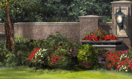
Glowing Lights in Photoshop
There are always complex ways to do things, but I tend to favor simple, effective techniques. What if you are doing a dusk or night rendering in Photoshop, and you want to add some lights, shining in the darkness? Select a simple feathered brush, sample the color of the light, and make one quick dab at the location of the light bulb. That is it!

In this architectural illustration, I added a string of festive lighting by tapping the brush at even intervals at the eave line. The color is a very pale yellow, which gives the appearance of clear bulbs, but it could just as easily have been brightly colored lights. The same technique will work on a more complex light fixture such as a carriage light. Paint the carriage light, then tap in the glowing bulb. Place the glow on it’s own layer in case you want to turn the light on and off!
Creating Seamless Textures
I use textures very frequently in my work, and a very simple trick can make them a lot more useful. It is often advantageous to have the texture tile seamlessly. To put it simply, have the pattern repeat, but in a way that is not apparent to the viewer. Usually signs of a repetition appear at the pattern edges. By using the “Offset” filter, which is found in Photoshop under Filter | Other | Offset, you can shift the pattern so the edges are visible. Set the horizontal and vertical distances as appropriate for your image, and check the Wrap Around radio button. The pattern will shift revealing the edges.

Once the edges are visible, rub them out with a sampling of the pattern. Run the Offset filter again, and look for any edges you might have missed. Repeat this exercise until edge lines are no longer visible. While rubbing out the edges, pay close attention to any distinguishing features in the pattern that might jump out as the pattern repeats. These should be rubbed out as well.
The final step is to fill a large area in a test file with your new pattern. If you cannot see any obvious repetition, your new pattern is a success!
Photoshop Guides
With snap activated in Photoshop, guides and objects will automatically align with each other. This can be an extremely useful tool. To have guides align with a layer, set that layer to be the active one. Drag the guide in from the ruler bar and it will attach to the outer edges and center points of that layer. To snap a guide to a location that is not the edge of a layer, create a selection with the selection tool. The guide will snap to the outer edges of the selection, which is indicated by the “marching ants”. When dragging a layer near another one, if you are moving slowly, they will snap to each other.

The same snaps will also work with text. Text will align with the edges and centers of objects or guides. Conversely these same objects will snap to the edges and centers of text.


