


Photoshop Files in a Hurry
One of the features in Photoshop in which I really take advantage, is the use of layers, lots of layers. Anything that might need to be edited is placed on it’s own layer. Thus the file size can get to be quite large, my files can range from 600mb to over 1gb. These large files can take quite a while to open, and if the only reason for opening the file is something simple like running a print, opening the layered file is not necessary.
Here is a short but very handy tip. Click FILE then click OPEN as usual. Find the file in the dialog box and highlight it with the cursor. Then holding down the Alt and Shift keys simultaneously, click on the OPEN button. A dialog box will pop up asking “Read the composite data instead?” Click YES and the file will open with all layers flattened. The time required to open the file is shortened dramatically. The layering is still intact on the original file, you are not altering it in any way. But a word of caution, do not save this version over the original or you will lose all your layering.
I use this option quite often and it saves a tremendous amount of time. Think of it next time you need to quickly send a small proof to your client!
Finding a Natural Green
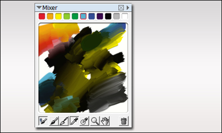
When painting your own plants, it can sometimes be difficult finding the right color of green. I use several methods for selecting colors. One is to use the mixer palette in Painter. The palette shown below exhibits a whole array of great natural greens, and I never used green in the mix. Most of the greens were established by mixing black and yellow. Then around the edges, I mixed in some cyan and blue. To get some red for flowers, I then mixed in a little red and orange. The additive colors were all chosen from the basic colors shown at the top of the mixer.
Here is a bush I painted in Photoshop using only the colors from the mixer palette. As you can see, I will often place some background colors behind the plant as I paint just to see how it will display against various background colors in the final painting.
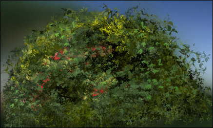
The final test is placing it in a few renderings to see if it blends well. If needed, I will make some highlight /shadow adjustments to finish of the plant before placing it in my library.
Adobe and Creative Suite 4
So Adobe has released it’s latest upgrade; Creative Suite 4 is available. As a Master Collection owner, I am looking at a hefty business cost, and I have been researching the benefits. Reading through the “new features” section under each program, there are some good improvements. But not finding the specifics, I have been checking out some of the videos on Adobe TV.
With my heavy workload, I do not have tons of time to spend on the web, so maybe everyone has seen this but me, but Adobe TV is a great resource. There are good tutorials and informational videos on all of their software, and setting up the Adobe Media Player gives free access to many videos including television programming and movies.
But I digress. The Adobe software I use most often is Photoshop, and to be honest, the new features will not help my daily workflow. I will, however continue to research, and look for that one reason to plunk down my hard earned cash. I will let you know.
On Painting Glass
One of the most difficult things, for me, is to get realistic looking glass when painting in Photoshop. As a great deal of my art is architectural, it is a very important part of each painting. Just as the eyes are important in painting portraits, I believe that the windows are what bring life to the building in architectural rendering. They are the “eyes” into the the building.
Unfortunately, each window seems to be done in a different way. I have never really come up with a set pattern, but here are some tips that I use. A window may be as simple as a solid color or a gradient. On a more complex level, the glass will consist of a multitude of layers. I will start with the interior, or what is on the other side of the glass. Then I will add the glass material itself, color, texture (if there is a texture to the glass), and try to arrive at the proper transparency level. Next comes the effect of the environment on the glass, a specular gradient, and then whatever is being reflected on the glass. Each of these will be put in place with different opacities and different blending modes. Again, none of the methods seem to be the same for each window, but by experimenting you can get it right.

There a number of factors to take into consideration when painting glass. Here are a few:
- Transparency level of the glass
- What is inside the window
- What is outside the window
- How the light is hitting the glass
- The angle of the glass to the viewer
- The specular light
- The shadows
- What is being reflected
- Window treatments, such as drapes or blinds inside
- The light inside
- The light outside
- The time of day
Sometimes, none of the above apply. If you notice in the rendering, I simply put a brighter light inside the only visible door to one of the condo units to make it a focal point of the image. Long live artistic license!


