


Painting the Vintage Santa Claus
It is hard to believe a whole year has passed since my last holiday tutorial on creating a stylized and shiny Christmas Tree in Photoshop. For this year, I have had some with a Santa Claus carrying his magical bag of toys.

Before starting to paint Santa, I did a little research on how artists have been portraying Santa. Unsurprisingly his appearance has evolved over the years, becoming ever more contemporary looking. Attracted to the Santa persona of years passed, I decided to make this one more of a vintage Santa Claus. I roughed in a sketch, creating a shorter, rounder Claus holding a very, very large bag of toys. To fill the color palette, I decided to use the colors of vintage Santa artwork circa 1900 to 1930. The reds and greens from that time period are very distinctive. The beard and fur colors have a definite yellowish tint, which not only “age” the vintage Santa, but adds a little warmth. The environment seems to be lit by the warm glow of a late night fire. Hope this gives you some ideas if you want to have some fun with holiday artwork of your own. Have a very Merry Christmas and a Happy New Year!
Santa is available in my shops on Etsy and Artfire.
Power of the Rendered Plan
I recently created a set of architectural illustrations for a multifamily residential project. They represented various aspects of the rather large development. Among the goals the builder wanted to accomplish on this Italian style design were some marketing concepts of the rear courtyards on the townhomes.
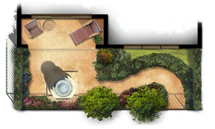
Small and simple, the plans reflect the way the outdoor courtyard spaces become part of each home’s living space. Each provides a fountain and sitting area with some low maintenance landscaping for aesthetics as well as privacy.
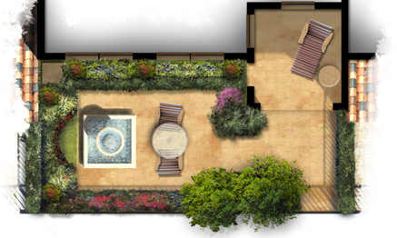
The artwork itself was created freehand in Photoshop using a variety of natural brushes. The landscaping plants themselves are loose and representational but suggest the colors and masses of possible garden ideas. The colors are bold and were carefully chosen to provide an eye catching marketing graphic for print as well as web presentation.
The Spirit of Halloween
There are several holidays that bring out the creative side in everyone. Halloween seems to be one of them. There is something about Halloween that fuels the imagination.

Catching the spirit, this art piece emerged from my imagination as a mixture of Halloween and the Fall season. It is available in my shops on Etsy and Artfire.
Pencils in Painter
Even though I do a lot of my digital art in Photoshop, Painter is still a very valuable tool. Its dedication to traditional media brushes and pencils is invaluable for getting certain strokes and textures. There are a lot of possibilities and unlimited variations. Here are a few samples of out of the box pencils.
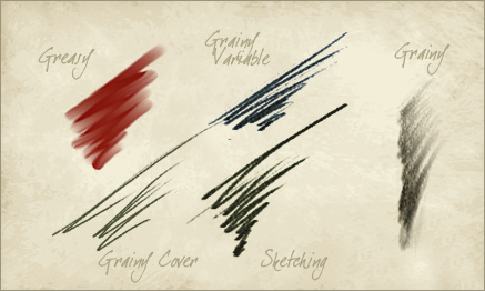
Painter also allows you to save to a PSD file, so if you want to create a piece with both Photoshop and Painter you can. Use the most effective tools from each software package to maximize your efforts and create something impossible with each one alone. I guess it is a “mixed media” painting in a digital sort of way.
More Social Media, Exploring Pinterest
No stranger to social media, when I first heard about Pinterest I was not sure I wanted to take on yet another platform. After exploring, however, it actually seemed like fun.

Without a real strategy, I have been experimenting to see how it works. I have created several boards featuring images that relate to my online projects, but for the most part, I have been using it as more of a research storage space. Particularly useful as a reference is the “art of lettering” board. If you are doing Pinterest, please stop by my board!
Rendering Architectural Elevations
I have created thousands of architectural illustrations, but in each and every one, I try to develop a new technique, explore new ways of using color, or learn something new. This not only keeps the work fresh and interesting, it allows me to grow as an artist and designer.

Creating a ragged edge around the rendered elevation is a technique I use frequently. At first glance it seems simple, but I spend more time on this than you might think. In effect, it creates a negative space in the artwork. Applied carefully, it will create balance, develop focal points, and enhance the motion in the piece.

Blobs of people shaped objects create life and activity while suggesting the scale of the architecture. The lack of detail keeps the focus on the architecture and not on specific characteristics of the people.

Framing a focal point with foreground landscaping will define the artwork’s motion and draw the visitors eye to the main architectural feature. The splash of color in the flowers create a sense of elegance while developing a contrast with the rustic stone.

Depth can be created with lighter colors in the background trees, this is a well known technique. It can also add depth in the foreground, visible in the walkway as it extends towards the viewer. Keep painting and enjoy the experience of trying something new each and every time!
This vs. That, Problem Solved
I have always tried to keep this blog more instructional than controversial, so I have decided to tackle the controversies all at one time. For years, across blogs, news articles, LinkedIn groups and every where in between, we are constantly drawn into the confrontation of “this vs. that”. Shall I bait you? Here we go: Mac vs PC, traditional art vs digital art, brick & mortar stores vs online retail, Democrats vs Rebublicans, 3dStudio vs Lightwave, iPhone vs Android, and on and on, etc. etc…

The premise is that you must choose one or the other. My thinking process (I am a glass is full, solution for every problem guy), tells me that “this vs that” is not an exclusive answer. When I was a kid, my father was always teaching me things, of course I had no knowledge I was learning things until twenty years later. But, one time I was trying to do a project in the garage, and no matter what I did I just could not accomplish what I was trying to do. May Dad watched me do this for hours, and all of a sudden, he went to a tool box, carefully picked up a tool and handed it to me. “Try this,” he said. Miraculously, I did in two minutes, what I had not been able to accomplish with hours of frustrating labor. A man of many words, my Dad then simply said, “The right tool for the right job.”
For years those few, simple, brilliant words have resounded in my head when I am confronted with the “this vs that” question. Because my answer is, without further delay… wait for it…
ALL OF THE ABOVE
If you follow my Dad’s advice, “The right tool for the right job”, all of the contestants in “this vs that” are merely tools to accomplish a goal. Each has their strong points and their weak points. The trick is knowing when to utilize each. At the end of the day, the accomplishment is what pays the bills, not whether a Mac or PC was used to get you there. (And for you die hards, I have both). Take stock of all of the tools available to you, and use the right tool for the right job!
Unfortunately my Dad passed away 23 years ago, and I miss him very much. But I would like to take this opportunity to say “Thank you Dad, for teaching me all of those great lessons, and Happy Father’s Day.”
Lighthouses and Artistic Expression
Recently I have been thinking about pursuing some of my own projects. I have on occasion done some quick sketches or abstract pieces to express myself as an artist, but I have not really presented them to public. Even though my main focus remains on commissioned work, I am going to be creating some other work, and making it available online. I have opened a shop on Etsy and another on Artfire.

One focus I am going to be exploring is a series on lighthouses. Lighthouses are an icon of our maritime past. They are unique in design, and the settings are always majestic. To that end, here are a couple of shots, above is the whole work and below is a closeup.

Another piece created for the shop is this humpback whale swimming leisurely through the sea. You can visit him at my Etsy shop here.

Concept Design Level of Detail
Concept artwork can serve a variety of purposes, and it is important to provide the level of detail that will accomplish the overall goals. In some cases an elevation with just enough detail to illustrate the design is all that is needed.

This type of illustration can be created in a shorter time frame, and with some color and texture, it can establish the mood or feeling of the intended design. If the final objective is to delineate exact features of the project, a more detailed concept may better accomplish your goal.

This final result can create quite an impact. The artwork, however, takes longer to develop, and because of the level of detail, the design must be much more complete. Either one is very valuable when developing a concept, and selling the design to the parties involved.
Instruments for Wild Acoustic Music Co.
Many of you know me as an artist and a designer, but you may not know about my love for music. I have been a musician for most of my life, and have always enjoyed playing music, talking about music, and having fun with other musicians. I have also found a lot of enjoyment in introducing the art of playing music to people who are just beginning to play or have always wanted to play. In support of these experiences, a while back I founded a music company called Wild Acoustic.
The Wild Acoustic Music Co. represents many name brands of course, but there is a twist that makes it really exciting: many of the instruments are hand made by various luthiers and craftsmen. Over the years, I have had the wonderful opportunity to meet and become friends with many of these artisans, and it is very exciting to represent their magical instruments and introduce them to a wider audience.
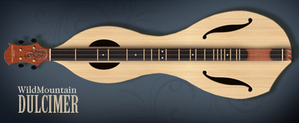
In addition to supporting these wonderful artists, I also design instruments for Wild Acoustic, and our workshop makes these instruments, but I have also established a wonderful friendship and working arrangement with a fabulous artisan named Jon Norris. He is the founder and genius behind Jon Norris Music and Arts. He applies his experience and talents to some of the more difficult to make instruments.
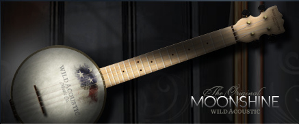
Pictured here are two of the new Wild Acoustic instruments. They are the Wild Mountain Dulcimer and the Moonshine Ukulele. I designed them using, none other than, Photoshop. It is a great tool with which to work as it allows freehand but controlled creation of the curves, and allows experimentation with materials and colors as part of the design.
You can explore the many fabulous musical instruments and see the new Wild Acoustic instruments online at WildAcoustic.com.
Using Artwork to Achieve Goals
I just had to create a post today, February 29, Leap Day. This opportunity will not come along for another four years! Opportunities are important, and creating specific artwork to accomplish particular goals is always a great opportunity. If you have worked in architecture, you know change is a big part of the vocabulary. I recently had the opportunity to create some project artwork for the second time, the first being created over a year ago. The scope of the project had completely changed since the first renderings. The architect had all new designs. But more importantly, the client had very specific needs.

The review committees as well as people in the community, were very interested in the overall design of the project and how it would impact the streetscape and also the local foot traffic. The landscape architect had spent quite a bit of time designing pedestrian spaces and landscaping to screen the building masses from the roadway. The goal of the artwork was to represent the landscape buffer and show the pedestrian friendly design, while still showing the architectural style of the project. This was a challenge because the landscaping would literally hide the building behind.

My strategy for the artwork revealed itself in several steps. The first was to select a view from the road which was the most relevant to the end viewers and decision makers. The second was to feature one of the major pedestrian spaces in the foreground, creating a warm pedestrian friendly feeling. The most difficult aspect was the landscaping. I showed the most prominent trees and hedges to maintain accuracy with the landscape design. Then I carefully filled in just enough plant material to create the impression of the final landscaping while still allowing the most detailed building features to show through.

The end result was met with very positive reaction. The designers were pleased with the representations of their designs, and the community was quite satisfied with the proposed appearance, and how the design would impact their neighborhood. A creative use of artwork: goals achieved!
Hand Painting Materials for 3d
In reality, not all walls are clean nor textures simple. Building surfaces are usually weathered, irregular, and complex. To achieve these characteristics in architectural 3d rendering, hand painting custom textures can provide amazing results.

In this example, the stone wall with brick peeking out from underneath is hand painted artwork, sized and applied to the wall surface. The stucco is hand painted as well, complete with imperfections. If desired, the texture can be made to look very realistic, or it can be a little more impressionistic to make the final result feel more like an art piece.


