


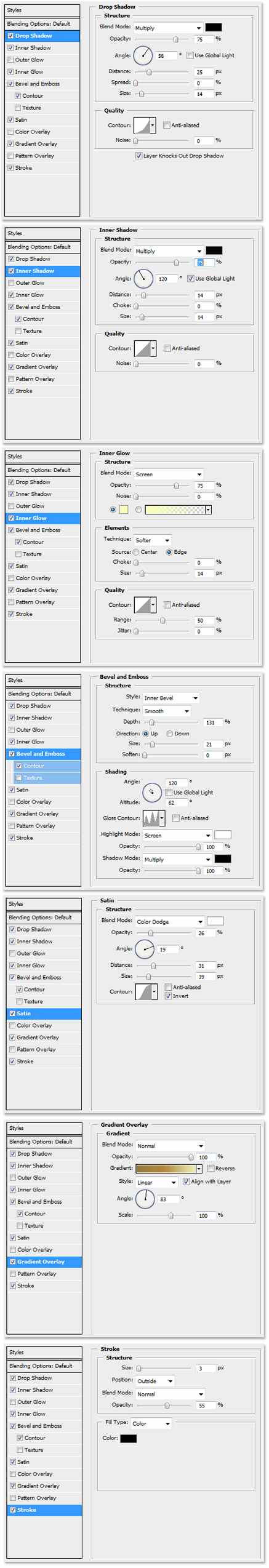
Painting the Holiday Tree
Recently I created a card for one of my clients, and it featured a stylized tree that was hand painted in Photoshop. The tree has an embossed “liquid gold” look, that was made possible by a layer style.

With the layer style applied to the layer before painting the tree, it created the unique feeling of painting with a paintbrush full of very heavy paint. Here are the settings for the layer style.

Environmental Impact in Architectural Art
The advantages of creating architectural concepts in 3d, include dimensional accuracy and authenticity of detail. The design presentation also requires, however, a few touches that warm the appearance and create an emotional connection to the sense of “place”. The best way to add these artistic connections is in the surrounding environment.

Nothing says home like the warm glow of lighting. Do not forget to add light fixtures, and then “turn them on” with a little glow. The warmth of lights inside the windows enhances the effect and also hints at activity inside the home. Some nice landscaping is obviously important, but little touches to the hardscape make it believable. Adding some stains to the sidewalk and some dirt to the brick pavers make the environment feel more natural. Finally a hint of a waterway with boats in the background, and a flowing fountain in the front create some life in an otherwise static environment.
Concept Design Presentation
When presenting concept designs, a little context goes a long way. When working on several candle concepts for an international candle company, I created some virtual sets so the decision makers could see the designs in the way their customers would see them.

One of the categories, seasonal candles, included some Halloween candles. A cozy front porch is the perfect place to display them. I quickly created a 3d front porch and rendered it with the jack-o-lantern candle concepts glowing on the front steps.

Another quick 3d model provided a warm place to display some tabletop candle holders. The background painting was a quick, colorful sketch painted freehand in Photoshop.
Fabulous Faces
Photography is an essential part of my design work. Occasionally something fun and unusual pops in front of the lens, and I thought I would share two of my favorites.

This alpaca walked right up to me, stopped chewing the grass in his mouth, and patiently waited for me to snap this shot.

Walking past a landscaped garden, I looked down and saw this little lizard’s face poking up through the skylight of his home.
Art Composition of Long Architecture
When creating architectural renderings of designs that feature geometry long in the horizontal direction and short vertically, composition can be an issue. The traditional idea is to show the front of the subject, but this can create a long, short proportion to the final artwork.

To keep a more normal canvas proportion, this piece take advantage of a short vanishing point in the perspective. Even though the far residences are not quite as visible, the depth adds a level of interest to the composition and keeps the artwork a more manageable size.
Making the Most of Gradients
When large areas of empty space enter your layout, a simple gradient can be much more effective than just a solid color. As you see below, a subtle gradient added to these simple colors can add quite a bit of interest.

To arrive at just the right gradient, try applying the gradient as a layer effect. This will allow you to test different colors and tweak the ramp very quickly. When you arrive at one you like, but want to try another, copy the layer and adjust the new one. This keeps the old option intact, should you want to go back to it. Save your favorite gradients or save the layer effect for future designs.
Suggesting Geometry with Shadow
When illustrating architecture, important elements may sometimes not be as visible as desired. This vignette of a larger work shows the trellis that occurs above the entrance drive. The posts are obviously visible as well as the ends of the trellis, but those features do not create the ambiance of the space.

The answer is to illustrate the trellis and the space it defines by introducing the shadows cast by the geometry. Even though the trellis members are not visible, the shadows create their existence in the viewer’s mind. Using a little creativity with the shadows you can also enhance the perspective by defining the locations of nearby surfaces.
Layer Effect Control using Groups
Photoshop Layer Effects are an effective and fast way to enhance your work. Sometimes when editing those layers, the effects do not always behave the way you want. For example, if you erase a section of the layer, the effect adjusts itself to match the new layer shape. This is illustrated in the graphic on the left.

This, however, is not always the way you may want the effect to work. You may want to remove a section of the layer and also obscure the effect as well. There is a very simple solution. Make a new group, and slide the layer you want to edit into it. Create a layer mask and use the eraser on the group instead of the layer. As you can see in the illustration on the right, a section of the layer is removed, but the effect does not adjust to the new layer shape.
Motion in Artwork
Creating a path in which the viewers eye will move can be done with color, texture or lines. It is a great way to center their focus when they look at your work. Red is always an immediate attention grabber and so are elements that are much brighter than the surrounding elements. Using them as the initial landing point is usually successful.

Once you establish the viewers landing point, path lines move the viewer’s eye where you want it to go. The lines can be actual lines such a s a road or walk. The path can also be created with landscaping, movement in the ground terrain, bright and dark variations, or the overall perspective of the piece. Placing a movement from the opposite direction, such as a stand of trees or some other opposing force will stop the eye movement at the focal point. A simple way to test your artwork’s movement is to close your eyes, open them quickly and see exactly where your own eye starts and stops. If your eye moves repeatedly in a similar path, you have been successful in creating a predictable motion in the piece. I chose this building rendering as an example because it has a very simplistic motion structure. Some have simple paths and some are much more complex and subtle, but motion is an important element in all of my work.
Adding Depth to a Rendered Elevation
A classic form of architectural illustration is the rendered 2D elevation. It can take on many forms: sketch, simple watercolor, marker, rough conceptual or detailed. If you really want to add just a little bit of life to the basic 2D elevation, make it a 2½ D elevation. By adding a little perspective to the foreground, and a little depth to the background, the artwork becomes a little more interesting.

Let’s start with the background. Create a little bit of sky to generate some atmosphere and establish the time of day. Next place a few trees or plants with slightly blurry detail behind the elevation. Then go for just a few more very blurry and lighter colored ones behind them. Voila! Instant depth.
The foreground is next. Flare the walk or a driveway with a little perspective and curve, and you immediately create foreground depth. A second touch just to finish the effect, enlarge the grass and the plants as they approach the bottom of the artwork. A little uneven vignette applied to them will add balance, edginess, and visual movement.
Architectural Illustration and the Metal Roof
One of the challenges of architectural illustration, is the representation of the many finish materials used in construction. Couple that with the complexities of natural atmosphere, sun, sky radiance, weathering of materials, and landscaping, and you have an even bigger challenge. Perhaps one of the most difficult materials to render is the silver colored standing seam metal roof.

There are several tricks that can prove to be very helpful. Do not use a silver or gray color, use a very desaturated blue. This will emulate the blue radiance from the sky. Constantly vary the color from dark to light, this will develop the matte reflection in the material. Copy and mirror architectural elements such as gables onto the metal and reduce the opacity to create subtle reflections. Lastly, paint dark seams next to lighter sections of the roof, and light seams next to the dark sections of roof. In the end, it takes a lot variation between light and dark, in just the right places, to make it work. Engaging in real world study of metal roofs under different lighting conditions will help you understand the subtleties of the material in your mind. So just have fun, experiment, and paint some metal!
Softening Brushes in Photoshop
Here is a quick tip for Adobe Photoshop. When painting with a soft brush, the key combination “Shift-[” will soften the brush on the fly. The combination “Shift-]” will sharpen the edges of the brush. Combining a very soft brush and reducing the flow rate will allow very subtle airbrush painting.


