


Concept Design Level of Detail
Concept artwork can serve a variety of purposes, and it is important to provide the level of detail that will accomplish the overall goals. In some cases an elevation with just enough detail to illustrate the design is all that is needed.

This type of illustration can be created in a shorter time frame, and with some color and texture, it can establish the mood or feeling of the intended design. If the final objective is to delineate exact features of the project, a more detailed concept may better accomplish your goal.

This final result can create quite an impact. The artwork, however, takes longer to develop, and because of the level of detail, the design must be much more complete. Either one is very valuable when developing a concept, and selling the design to the parties involved.
Instruments for Wild Acoustic Music Co.
Many of you know me as an artist and a designer, but you may not know about my love for music. I have been a musician for most of my life, and have always enjoyed playing music, talking about music, and having fun with other musicians. I have also found a lot of enjoyment in introducing the art of playing music to people who are just beginning to play or have always wanted to play. In support of these experiences, a while back I founded a music company called Wild Acoustic.

The Wild Acoustic Music Co. represents many name brands of course, but there is a twist that makes it really exciting: many of the instruments are hand made by various luthiers and craftsmen. Over the years, I have had the wonderful opportunity to meet and become friends with many of these artisans, and it is very exciting to represent their magical instruments and introduce them to a wider audience.
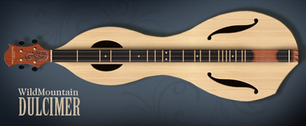
In addition to supporting these wonderful artists, I also design instruments for Wild Acoustic, and our workshop makes these instruments, but I have also established a wonderful friendship and working arrangement with a fabulous artisan named Jon Norris. He is the founder and genius behind Jon Norris Music and Arts. He applies his experience and talents to some of the more difficult to make instruments.

Pictured here are two of the new Wild Acoustic instruments. They are the Wild Mountain Dulcimer and the Moonshine Ukulele. I designed them using, none other than, Photoshop. It is a great tool with which to work as it allows freehand but controlled creation of the curves, and allows experimentation with materials and colors as part of the design.
You can explore the many fabulous musical instruments and see the new Wild Acoustic instruments online at WildAcoustic.com.
Concept Design Presentation
When presenting concept designs, a little context goes a long way. When working on several candle concepts for an international candle company, I created some virtual sets so the decision makers could see the designs in the way their customers would see them.

One of the categories, seasonal candles, included some Halloween candles. A cozy front porch is the perfect place to display them. I quickly created a 3d front porch and rendered it with the jack-o-lantern candle concepts glowing on the front steps.

Another quick 3d model provided a warm place to display some tabletop candle holders. The background painting was a quick, colorful sketch painted freehand in Photoshop.
Art Composition of Long Architecture
When creating architectural renderings of designs that feature geometry long in the horizontal direction and short vertically, composition can be an issue. The traditional idea is to show the front of the subject, but this can create a long, short proportion to the final artwork.

To keep a more normal canvas proportion, this piece take advantage of a short vanishing point in the perspective. Even though the far residences are not quite as visible, the depth adds a level of interest to the composition and keeps the artwork a more manageable size.
Making the Most of Gradients
When large areas of empty space enter your layout, a simple gradient can be much more effective than just a solid color. As you see below, a subtle gradient added to these simple colors can add quite a bit of interest.

To arrive at just the right gradient, try applying the gradient as a layer effect. This will allow you to test different colors and tweak the ramp very quickly. When you arrive at one you like, but want to try another, copy the layer and adjust the new one. This keeps the old option intact, should you want to go back to it. Save your favorite gradients or save the layer effect for future designs.
Graphic Repetition to Create Depth
Not too long ago I was engaged to create a concept design for a very large ocean side resort. To complete the artwork, I soon realized the large pool and amenity area, which was not part of the project, would be visible in the foreground. “Come up with something” was the client’s response, so with little to go on, I quickly created this concept.


Graphically, one of the techniques I used to help show the changes in elevation, the turns in the landscape, and the distance from camera, was to use a repeated object. In this case, the repeated object is the lounge chair. As the viewer’s eye moves around the artwork, the different sizes and positions of the chair help delineate the landscape.
Symmetry, Simplicity, Art, Design
Alone, iconic, and symmetrical, the design calls for a landscape feature at the center of a round about. As it will be seen from all sides, it must be the same on all sides. Themed and representative, the style must accentuate the identity while not being obtrusive. It must be highly visible while not blocking any views. The design answer is symmetrical and simple.

Like the design, the illustration portrays the same simplicity. Only a hint of background and a grass line foreground, suggest the environment but do not detract from the focus. The spray and fall of water provide compositional balance between the landscape’s features. The color palette is simple and light so as not to be a part of the design presentation.
When the design question calls for a simple answer, keep it simple. When the design is simple, quiet elegant artwork will keep the focus where it belongs: on the design. Symmetry between design and the representational artwork is a very, very effective strategy.
Learning Skills: Art and Design
I have always felt that there are three sides to improving art skills or design skills. The first objective, the “Creative” side, seems to be inherited to some extent, but there are many techniques and exercises to improve creative thinking. Keep in mind, even the most creative minds hit blocks now and then. They must overcome their “blocks” as everyone does. Exercises in creative thinking are varied and sometimes kind of crazy, but usually fun!
Secondly there is “Technical Expertise”. Whether you are painting with traditional watercolors, painting digitally in Photoshop, or laying out a website in Dreamweaver, there are skills that must be learned in order to create your vision effectively. By mastering the needed skills, you can concentrate more on realizing your creative vision, and less time figuring out how to accomplish the task. Many tutorials and learning materials seem to concentrate on technical expertise. They are usually fun, but often are oversimplified. Paint this here, and draw this here, now run a curves layer and set opacity to 20%… This will help you create the particular assignment, but a huge ingredient is missing. That ingredient is: Why do you do this?
Which brings up the third objective, and to me the most important one. That would be “Theory”. Theory is the underlying knowledge of art and design. Why does glass look the way it does? Why do shadows fall the way they do? Why do colors contrast differently when placed side by side? What effects do grids have on composition? How could Seurat paint detailed paintings with nothing but strategically placed colored dots? Why is that building proportionally challenged? What color is a cloud? How does light reflect when it hits water?
My mind is racing with these questions constantly. Many can just be answered by observing the world around you. Learn to not only look at the world, but actually see it. You will get some strange looks from people when they see you staring at a rock, but I guarantee they will not understand it’s texture, color, specular highlights, shadow intensities, or it’s complexity of shape. But how can you represent one, if you do not know these details?
Another great place to look for insights into theory would be the work of other artists. Look at famous artists, of course, but also look at the work of contemporary artists. The exercise I generally employ is to observe as much art as possible from many sources. When a piece of work jumps out at me, and makes me say “Wow!” as soon as I see it, I stop and analyze the piece to see what impresses me about the work. Is it composition? Is it color? Is it texture? Why do I like it? Why, why, why?
Only by exposing ourselves to new experiences and learning from them can we grow as artists. Look at the details and try to understand the theories that make them all work. With theory and technique in your grasp, your creativity can run wild.


