


Archive for the 'Photoshop' Category
Adobe and Creative Suite 4
So Adobe has released it’s latest upgrade; Creative Suite 4 is available. As a Master Collection owner, I am looking at a hefty business cost, and I have been researching the benefits. Reading through the “new features” section under each program, there are some good improvements. But not finding the specifics, I have been checking out some of the videos on Adobe TV.
With my heavy workload, I do not have tons of time to spend on the web, so maybe everyone has seen this but me, but Adobe TV is a great resource. There are good tutorials and informational videos on all of their software, and setting up the Adobe Media Player gives free access to many videos including television programming and movies.
But I digress. The Adobe software I use most often is Photoshop, and to be honest, the new features will not help my daily workflow. I will, however continue to research, and look for that one reason to plunk down my hard earned cash. I will let you know.
Considerations when Rendering Green
For those of us doing architectural visualization, our libraries of plant materials are very important. As I have mentioned before, I create my own plant materials, but it is how they are blended into the rendering that is important.
One very important aspect to consider, is the color of green we use in our plants. If using from your library, adjust contrast and shadow to make the plant blend with the surroundings. Then, adjust the color with a color overlay or a curves adjustment layer.

In this example, I adjusted the palm color with a curves layer to make it blend with the early evening sky. I also added some highlights and shadows to the fronds with some sampled colors.
On Painting Glass
One of the most difficult things, for me, is to get realistic looking glass when painting in Photoshop. As a great deal of my art is architectural, it is a very important part of each painting. Just as the eyes are important in painting portraits, I believe that the windows are what bring life to the building in architectural rendering. They are the “eyes” into the the building.
Unfortunately, each window seems to be done in a different way. I have never really come up with a set pattern, but here are some tips that I use. A window may be as simple as a solid color or a gradient. On a more complex level, the glass will consist of a multitude of layers. I will start with the interior, or what is on the other side of the glass. Then I will add the glass material itself, color, texture (if there is a texture to the glass), and try to arrive at the proper transparency level. Next comes the effect of the environment on the glass, a specular gradient, and then whatever is being reflected on the glass. Each of these will be put in place with different opacities and different blending modes. Again, none of the methods seem to be the same for each window, but by experimenting you can get it right.

There a number of factors to take into consideration when painting glass. Here are a few:
- Transparency level of the glass
- What is inside the window
- What is outside the window
- How the light is hitting the glass
- The angle of the glass to the viewer
- The specular light
- The shadows
- What is being reflected
- Window treatments, such as drapes or blinds inside
- The light inside
- The light outside
- The time of day
Sometimes, none of the above apply. If you notice in the rendering, I simply put a brighter light inside the only visible door to one of the condo units to make it a focal point of the image. Long live artistic license!
Photoshop Groups
Here is a quick tip you may not know about, but it is one that saves me a lot of time. If you are like me, you use a lot of layers when creating an image. Sometimes I may have hundreds of layers. To keep them organized and manageable, I arrange related layers in groups. The usual way to do this would be to create the group using the pulldown, and then, on the layers palette, select the layers and slide them into the new group.

There is a quicker way. Go to the layers palette and select the layers you wish to group. Then just use the keyboard shortcut ctrl-G. Instantly the group will be created, and the selected layers will be placed into the new group.
Color Blending in Photoshop
One of the issues in using Photoshop for artwork, involves the blending of colors during brush strokes. The solution is found under Color Dynamics in the brush palette. The first setting allows you to set the jitter between the foreground and background colors. This will create color variations while you paint.
A favorite setting of mine involves setting the Control option to “Fade”. This will blend the foreground color into the background color as you paint, creating a color gradient during the brush stroke. The number adjacent to the “Fade” setting sets how quickly or slowly the background color blends into the foreground color.
Photoshop Circles
Some of you may know this one already, but I get this question from Photoshop users a lot: How do I draw a circle or arc? The answer is a little round about, but not difficult.
To begin with, create a new layer on which you want the circle. Then hold down the square marquee tool until the flyout appears, select the elliptical marquee tool. Click a point in your graphic to begin the selection marquee. While holding the shift key to constrain the marquee to a perfect circle, drag and then release to create the circle selection. You should now see the marching ants in a circle on your screen.
To create the circle, go to the edit menu and select the Stroke command. The dialog box will prompt you for line thickness, color, and so forth, when ready press “ok”. Your circle will appear in your graphic. For an arc, erase the portion of the circle you do not want.
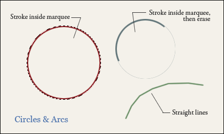
Another way to create an arc is a little simpler, but less precise. When using the brush tool, click once as if to make a dot, and while holding the shift key, move to another location and press again as if to make another dot. You will then get a straight line between the two points. Shift and press again to get a continuation of the line. By moving around in an arc or circular pattern, you can create a faceted arc. Shorter, more precise segments will create a smoother arc. This method is crude, but very quick and controllable. I’m sure there are even more ways, there always are, but any of these three methods can get you started.
Photoshop Layer Creation
Here are a couple quick tips on Adobe Photoshop. It is fairly obvious that clicking the little layer icon on the Layers palette creates a new layer. But, if you hold down the Alt key while clicking, the dialog box pops up allowing you to type in a name for it.
Sliding a layer name from the list onto the layer icon creates a duplicate of that layer. Similarly, holding down the Alt key while sliding a layer name onto it, pops up the dialog box allowing you to enter a name for the duplicate.


