


Archive for the 'Art' Category
Learning Skills: Art and Design
I have always felt that there are three sides to improving art skills or design skills. The first objective, the “Creative” side, seems to be inherited to some extent, but there are many techniques and exercises to improve creative thinking. Keep in mind, even the most creative minds hit blocks now and then. They must overcome their “blocks” as everyone does. Exercises in creative thinking are varied and sometimes kind of crazy, but usually fun!
Secondly there is “Technical Expertise”. Whether you are painting with traditional watercolors, painting digitally in Photoshop, or laying out a website in Dreamweaver, there are skills that must be learned in order to create your vision effectively. By mastering the needed skills, you can concentrate more on realizing your creative vision, and less time figuring out how to accomplish the task. Many tutorials and learning materials seem to concentrate on technical expertise. They are usually fun, but often are oversimplified. Paint this here, and draw this here, now run a curves layer and set opacity to 20%… This will help you create the particular assignment, but a huge ingredient is missing. That ingredient is: Why do you do this?
Which brings up the third objective, and to me the most important one. That would be “Theory”. Theory is the underlying knowledge of art and design. Why does glass look the way it does? Why do shadows fall the way they do? Why do colors contrast differently when placed side by side? What effects do grids have on composition? How could Seurat paint detailed paintings with nothing but strategically placed colored dots? Why is that building proportionally challenged? What color is a cloud? How does light reflect when it hits water?
My mind is racing with these questions constantly. Many can just be answered by observing the world around you. Learn to not only look at the world, but actually see it. You will get some strange looks from people when they see you staring at a rock, but I guarantee they will not understand it’s texture, color, specular highlights, shadow intensities, or it’s complexity of shape. But how can you represent one, if you do not know these details?
Another great place to look for insights into theory would be the work of other artists. Look at famous artists, of course, but also look at the work of contemporary artists. The exercise I generally employ is to observe as much art as possible from many sources. When a piece of work jumps out at me, and makes me say “Wow!” as soon as I see it, I stop and analyze the piece to see what impresses me about the work. Is it composition? Is it color? Is it texture? Why do I like it? Why, why, why?
Only by exposing ourselves to new experiences and learning from them can we grow as artists. Look at the details and try to understand the theories that make them all work. With theory and technique in your grasp, your creativity can run wild.
On Andrew Wyeth
I am very saddened to hear that Andrew Wyeth has passed away at the age of 91. He has long been one of my favorite artists. His most recognized work is probably “Christina’s World”, but two of my favorites are “Trodden Weed” and “Faraway”. Two books about him are presently in my library. The book “Andrew Wyeth: Memory and Magic” is a wonderful book about him, and “Andrew Wyeth: Autobiography” has an excellent collection of his artwork. I recommend them both. If you are not familiar with Andrew Wyeth, you can see his official website at AndrewWyeth.com. Some more of his beautiful work can be seen at the Museum Syndicate and on the site of Mr. Wyeth’s representative.
Painting in the Material World
One of the common tests used in a 3d renderer is a simple sphere demonstrating materials and lighting. I am going to use a similar test to illustrate some 2d concepts. The following graphic was painted completely in Photoshop. The total time was under five minutes.

Granted it is nothing special from an artistic point of view, but when you are enhancing a 3d render in Photoshop, it is very important to understand what makes your 2d objects blend seamlessly with the render. Shadows are obvious of course, but never use black. I always like to use a darker, complementary color to make it pop. Use a blur filter to match the edges produced in the render.
Always remember to add specular highlights, they will add an extra bit of realism to your object. Then sample colors from the surrounding areas, and with a reduced brush opacity add some color to adjacent surfaces on your object. This will give the illusion that light is being reflected from surrounding objects. The next step is to copy merge adjacent areas and paste onto your object to add possible reflections. This step will depend on your material properties.
Finally, tint the whole object as required to make it look like it was rendered with the same light source. For example, if your render’s light source simulates dusk, you may need to tint your object with a little purple or blue.
This may seem like a lot of steps for each object in your rendering, but practice will enable you to do it quickly. The result will be added realism to your work. Practice with a simple sphere, and study how all of the material properties come into play within different environments. You may also find this knowledge will help you with your material development within the renderer.
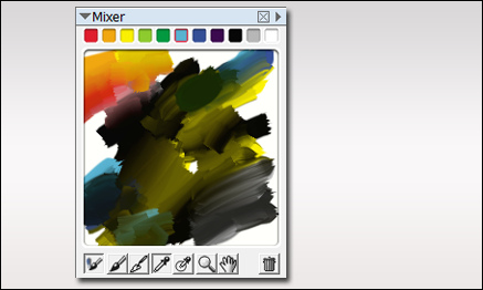
Finding a Natural Green
When painting your own plants, it can sometimes be difficult finding the right color of green. I use several methods for selecting colors. One is to use the mixer palette in Painter. The palette shown below exhibits a whole array of great natural greens, and I never used green in the mix. Most of the greens were established by mixing black and yellow. Then around the edges, I mixed in some cyan and blue. To get some red for flowers, I then mixed in a little red and orange. The additive colors were all chosen from the basic colors shown at the top of the mixer.
Here is a bush I painted in Photoshop using only the colors from the mixer palette. As you can see, I will often place some background colors behind the plant as I paint just to see how it will display against various background colors in the final painting.
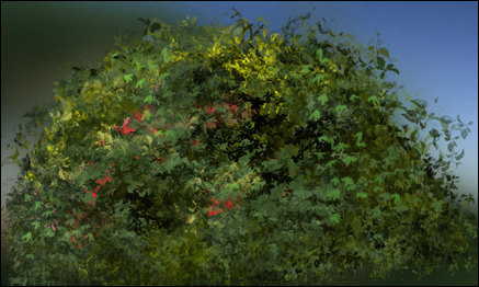
The final test is placing it in a few renderings to see if it blends well. If needed, I will make some highlight /shadow adjustments to finish of the plant before placing it in my library.
Considerations when Rendering Green
For those of us doing architectural visualization, our libraries of plant materials are very important. As I have mentioned before, I create my own plant materials, but it is how they are blended into the rendering that is important.
One very important aspect to consider, is the color of green we use in our plants. If using from your library, adjust contrast and shadow to make the plant blend with the surroundings. Then, adjust the color with a color overlay or a curves adjustment layer.

In this example, I adjusted the palm color with a curves layer to make it blend with the early evening sky. I also added some highlights and shadows to the fronds with some sampled colors.
Traditional Art vs Digital Art
I recently watched a special on cable about the history of Pixar. The story evolves as John Lasseter tries to introduce computer animation to Disney, only to find them bewildered by the whole idea. He starts Pixar to follow his dream, and the industry of computer animated movies takes the world by storm. Strangely, as the traditional animators see the success of computer animation, they begin to abandon the traditional arts. As I see it, the medium doesn’t really matter. It is all about content, content, content. Pixar‘s recent film, “Ratatouille”, is beautiful graphically, but it is also a very entertaining and well developed story. I do not believe it invalidates the hand drawn “Jungle Book”, it is simply a different art medium.
I see a similar battle brewing between traditional art and digital art. Digital art seems to be winning on sci-fi and game art, but that whole genre doesn’t seem to be well supported in the established world of art. I find this odd in that most traditionally painted art these days is scanned into digital form and sold in quantity as “limited edition prints”. Something that really drove this home for me, I recently ran across a web site or “club” where users could join and submit their artwork. Digitally produced artwork was not permitted. Now it’s their club, they can make whatever rules they want, but again I believe beautiful art is beautiful art. Oils, watercolors, acrylics, digital are all just different vehicles for true artists to tell their stories on canvas. Just looking at the beautiful digital work of Philip Straub, Ryan Church, or Katarina Sokolova makes my point. Is there work art?
I have been giving this a lot of thought, because I make my living as a concept designer and artist. I began my career using traditional oil paints. For many years, however, I have been working digitally. My question: will my career as an artist be stifled by the establishment because it is digital, or will I follow in the trend Pixar set and enjoy the benefits of a new medium?
My belief – art should stand or fall on the merit of it’s content, and not the choice of art medium.
Watercolors by Winslow Homer
An inspiring book – Watercolors by Winslow Homer: The Color of Light – written by Martha Tedeschi with Kristi Dahm, has sent me once again on a new path. The book features many works by the great watercolorist, but more importantly, Homer’s techniques and materials are discussed as they related to each piece.
Of course, my mind began trying to develop digital techniques that would create some of these fantastic styles. Homer’s use of light and composition are also quite intriguing, causing me to rethink some of my own thoughts on highlights and subject relationships.
If you have never seen the works of Winslow Homer, the online National Gallery of Art Exhibition is very well done. The Art Institute of Chicago Exhibition also has very informative resources. You may want to check them out as well as this book, I recommend it highly.
On Painting Glass
One of the most difficult things, for me, is to get realistic looking glass when painting in Photoshop. As a great deal of my art is architectural, it is a very important part of each painting. Just as the eyes are important in painting portraits, I believe that the windows are what bring life to the building in architectural rendering. They are the “eyes” into the the building.
Unfortunately, each window seems to be done in a different way. I have never really come up with a set pattern, but here are some tips that I use. A window may be as simple as a solid color or a gradient. On a more complex level, the glass will consist of a multitude of layers. I will start with the interior, or what is on the other side of the glass. Then I will add the glass material itself, color, texture (if there is a texture to the glass), and try to arrive at the proper transparency level. Next comes the effect of the environment on the glass, a specular gradient, and then whatever is being reflected on the glass. Each of these will be put in place with different opacities and different blending modes. Again, none of the methods seem to be the same for each window, but by experimenting you can get it right.

There a number of factors to take into consideration when painting glass. Here are a few:
- Transparency level of the glass
- What is inside the window
- What is outside the window
- How the light is hitting the glass
- The angle of the glass to the viewer
- The specular light
- The shadows
- What is being reflected
- Window treatments, such as drapes or blinds inside
- The light inside
- The light outside
- The time of day
Sometimes, none of the above apply. If you notice in the rendering, I simply put a brighter light inside the only visible door to one of the condo units to make it a focal point of the image. Long live artistic license!
Artwork at Dusk
I have been quite busy lately, producing various kinds of artwork, and even some website work. One project involved a concept and rendering of this small condominium unit.

Here are a couple of larger shots, details in architecture are very important. The additions of light fixtures and other stylized items add a little more realism to the concept.


I set the time of day at dusk just to add a little atmosphere. Used effectively, unusual weather or time of day can create additional mood in an architectural rendering. If you would like to see more of my work, check out my portfolio at www.BlueNoseGopher.com
Grain in Painter
Here is a quick tip on Corel Painter. If you are trying to adjust the amount of paper grain that shows through in your brush stroke, adjust the “Grain” percentage in the brush toolbar.

A lower number creates more apparent grain. A higher number reduces the amount of grain. If you are like me, this seems to be a little backward, but Painter treats the higher number as deeper penetration in the paper.
Rendering Landscapes
How do you render the landscapes? This is one question that is asked of me often. The answer is, simply, a mixture of techniques. I use 3ds Max or Lightwave to render buildings and main features, but all of the plant material and hardscape are created in Adobe Photoshop or Corel Painter.

For the most part, plants and landscape features are painted by hand. Sometimes I will paint them in place, and other times I will paint them in a separate file for use in the final painting. As long as the landscape “pieces” are created on their own layer, they can be manipulated and used in many different ways.

Here are a few hand painted bushes that were painted as individual graphics for use in landscaping. As you can see they are somewhat impressionistic, and you might think this will detract from the realism. The key is to blend them together wisely in the final painting. When shadows and highlights are applied properly, the final effect can be quite realistic.
Traditional Colors
One of the issues I have always had in digital painting, is choosing the right colors. Each type of traditional media has limitations based on the pigments available. Watercolors, for example, have a limited color range even when mixing various paints. Paint software, however, offers an unlimited number of colors, regardless of the medium you are trying to emulate. Using watercolor brushes, but unrealistic colors, will not create a traditional looking painting.
An interesting feature in Corel Painter exists in the color swatch dialog. It can really help you build an appropriate color palette. The first step is to open an image, a scan of an actual watercolor or oil painting for example, that contains the type of color palette you wish to use. Then select the triangle at the upper right of the color swatch dialog. A menu appears with several options available.

Select “New Color Set from Image”. Painter will sample and create a color set of the swatches available in the image. Providing you use an appropriate source, you should now have a proper color range that will allow you to create a more true to life traditional painting.


