


Author Archive
Photoshop Circles
Some of you may know this one already, but I get this question from Photoshop users a lot: How do I draw a circle or arc? The answer is a little round about, but not difficult.
To begin with, create a new layer on which you want the circle. Then hold down the square marquee tool until the flyout appears, select the elliptical marquee tool. Click a point in your graphic to begin the selection marquee. While holding the shift key to constrain the marquee to a perfect circle, drag and then release to create the circle selection. You should now see the marching ants in a circle on your screen.
To create the circle, go to the edit menu and select the Stroke command. The dialog box will prompt you for line thickness, color, and so forth, when ready press “ok”. Your circle will appear in your graphic. For an arc, erase the portion of the circle you do not want.
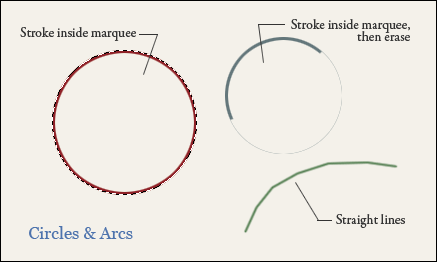
Another way to create an arc is a little simpler, but less precise. When using the brush tool, click once as if to make a dot, and while holding the shift key, move to another location and press again as if to make another dot. You will then get a straight line between the two points. Shift and press again to get a continuation of the line. By moving around in an arc or circular pattern, you can create a faceted arc. Shorter, more precise segments will create a smoother arc. This method is crude, but very quick and controllable. I’m sure there are even more ways, there always are, but any of these three methods can get you started.
Fantasy Art Workshop
Lately I have been reading a book by artist, John Howe, entitled “Fantasy Art Workshop”. It was the beautiful artwork on display that prompted me to get the book, but his insights and excellent writing style have kept me reading from cover to cover. One of the pearls of wisdom is advice on holding your pencil. Basically hold your pencil any way but the way you hold it to write. (There are some photo examples in the book.)
Trying this with a pencil and sketch paper, and then later in Painter with my Wacom tablet’s stylus, I have found that it really can make a difference. It adds a different touch to your brush strokes. Even though my hand cramps a little after a while, I am going to stay with it. Check out the book.
Concept Design in Photoshop
Everyone is familiar with Adobe Photoshop image editing capabilities, and also Photoshop’s painting features. I have actually been using it for something different: architectural concept creation. Instead of trying to develop elevations in cadd, where precision can get in the way of creativity, the freeform painting in Photoshop allows a much faster and simpler creative flow.

One great feature is the fixed aspect marquee tool. After setting up the proportions you want, you can scale the marquee box to the relationship that works with adjacent structure. Another advantage is working with solid color. Filled geometric shapes are easier to work with than line based graphics. The transform tool can be used to vary the solid shapes and relationships, visually adjusting the design. After adding some details, a full color graphic is ready to present to the client.
Image Adjustment in Lightroom
I purchased Adobe Lightroom actually looking for something to help me file and categorize my thousands of pieces of artwork, graphics, and photography. What I have found, however, is that some of the really useful features in Lightroom are the color correction capabilities. For some images that never seemed to be quite right in Photoshop, I have been able to get them just the way I want them in a matter of a few minutes using Lightroom.
Especially useful for me, is the ability to compare two images side by side, make adjustments, and then review again. Using this method, it is possible to get a series of graphics to have the same look and feel. This is very powerful for creating a group presentation for example. Also, if you get one image corrected, you can copy the adjustment settings from it to similar images. A series can all be corrected very quickly.
Other good news is that adjustments are all not destructive and preserved for each image. If a month from now, you wish to modify the previous corrections, they are all still in the stack and editable. This software is definitely worth a look if the capabilities can help streamline your workflow.
Photoshop Layer Creation
Here are a couple quick tips on Adobe Photoshop. It is fairly obvious that clicking the little layer icon on the Layers palette creates a new layer. But, if you hold down the Alt key while clicking, the dialog box pops up allowing you to type in a name for it.
Sliding a layer name from the list onto the layer icon creates a duplicate of that layer. Similarly, holding down the Alt key while sliding a layer name onto it, pops up the dialog box allowing you to enter a name for the duplicate.
Grain in Painter
Here is a quick tip on Corel Painter. If you are trying to adjust the amount of paper grain that shows through in your brush stroke, adjust the “Grain” percentage in the brush toolbar.

A lower number creates more apparent grain. A higher number reduces the amount of grain. If you are like me, this seems to be a little backward, but Painter treats the higher number as deeper penetration in the paper.
Rendering Landscapes
How do you render the landscapes? This is one question that is asked of me often. The answer is, simply, a mixture of techniques. I use 3ds Max or Lightwave to render buildings and main features, but all of the plant material and hardscape are created in Adobe Photoshop or Corel Painter.

For the most part, plants and landscape features are painted by hand. Sometimes I will paint them in place, and other times I will paint them in a separate file for use in the final painting. As long as the landscape “pieces” are created on their own layer, they can be manipulated and used in many different ways.

Here are a few hand painted bushes that were painted as individual graphics for use in landscaping. As you can see they are somewhat impressionistic, and you might think this will detract from the realism. The key is to blend them together wisely in the final painting. When shadows and highlights are applied properly, the final effect can be quite realistic.
Traditional Colors
One of the issues I have always had in digital painting, is choosing the right colors. Each type of traditional media has limitations based on the pigments available. Watercolors, for example, have a limited color range even when mixing various paints. Paint software, however, offers an unlimited number of colors, regardless of the medium you are trying to emulate. Using watercolor brushes, but unrealistic colors, will not create a traditional looking painting.
An interesting feature in Corel Painter exists in the color swatch dialog. It can really help you build an appropriate color palette. The first step is to open an image, a scan of an actual watercolor or oil painting for example, that contains the type of color palette you wish to use. Then select the triangle at the upper right of the color swatch dialog. A menu appears with several options available.

Select “New Color Set from Image”. Painter will sample and create a color set of the swatches available in the image. Providing you use an appropriate source, you should now have a proper color range that will allow you to create a more true to life traditional painting.
ZenGarden
 I seem to be writing a lot of posts about css lately, but I have been working on a new site and it is on my mind. A very interesting spot on the web that is worth checking out is CssZenGarden. In a nutshell, the concept is one page of structural markup, that is styled by user submitted css files. The submitted designs are quite spectacular. If you are unsure of the value of using css over tables, this site should convince you. If you are just interested in looking at beautiful web pages, this is also the place. cssZengarden.com
Learn from the Masters
I started out as a traditional artist, mostly oil paintings and watercolors. But as I my career progressed, I began working in architectural illustration. After a few projects, I quickly switched to using a computer, producing digital art. I participated in the very early stages of 3d imaging using 3d Studio Max and Lightwave. The goal for a long time (and still is, in many circles) was to create something that almost looked like a photo. Creating artwork that could not be distinguished from a real photo, for architectural illustration, does have some benefits. I never had a shortage of clients or income, but the precision required for this type of work can be quite time consuming, and that is definitely a drawback.
A couple of years ago, while browsing around a bookstore, I happened upon the arts section and picked up a book on Andrew Wyeth. Needless to say I was blown away by what I saw. Even though Andrew Wyeth’s work has a very “real” quality, the composition, texture and color, not to mention the striking light and shadow reveal the genius of his work. Intrigued by my discovery, the next selection I picked up was Georgia O’Keefe. Even though she was an abstract painter, the realism in her paintings of flowers and landscape came through in her use of color and contrast. Again with O’Keefe’s work, the composition was amazing. Other selections included John Singer Sargent, Claude Monet, Norman Rockwell, Thomas Kinkade, and Edward Hopper. Each artist featured a totally different style, but the beauty of their work filled me with inspiration.
My next thought: could I apply some of what I found here; techniques of these masters of traditional art to the digital medium, and improve my artwork. My first step was to drop the absolute, photorealistic ideal and move a little more towards the impressionist style. By introducing brushstrokes and a little more “grain” to the project, I found not only did I increased the speed at which I work, but I began to concentrate more on composition, color and texture to achieve the representation of my subject. Overnight, it seemed my work took on a whole new meaning.
My client’s responded very positively to the new style, and even though I still recieve a lot of comments about how real it looks, they love the fact that it looks more like a nice piece of artwork. Needless to say the demand for my art has grown as a result. I have since made an effort to study the masters, and apply the techniques to digital work wherever possible. I also have to admit, it has made working, a lot more fun!
The Same Only Random
When browsing around the web, there is something I have noticed when looking at some architectural renderings. Given, the focus is always the building. That’s where most of the effort lies in modeling, textures, and lighting; but the landscaping, if not done with care, can ruin the painstaking effort for realism in the building.
In nature, everything occurs at random. No two trees, bushes, or blades of grass are the same. Many artists, however, will take the same graphic of a plant and repeat it throughout the work. This is fine, but care should be taken to vary the shape, and lighting wherever it is used so a repetition doesn’t develop. Amazingly, those viewing the work will pick up on it no matter how subtle the repetition becomes. The viewer may not know what it is, but they will know something is off. A little extra time spent on these little details can make the difference between a good rendering and a great one.
To Blog or Not to Blog
Not too long ago, I thought it might be fun to start an online magazine (still working on it!), so I began a search for a content management system that would work for that purpose. I tried all of the main CMS options, and none seemed to do what I wanted. I finally ran across Movable Type which is fantastic, and is working out well for my needs on that project. But, during this evaluation process, I discovered WordPress, and it really caught my attention.
So while reading Andy Clarke’s new book about CSS, my enthusiasm to try some of his techniques found me in front of WordPress attempting a template design. Well, I am excited to say that setting up a blog was as simple as could be. In a very short time, I had it installed, a template created, and found myself looking at a “write post” screen. So without any intentions of really doing so, I find myself with my own blog.
I have to really give my recommendations for both Movable Type and WordPress. But if you are really just wanting to get a blog up and working without a lot of effort, WordPress is the real deal. Now I’m looking at the plugins and options that are available and my mind is racing with all of the possibilties . . .


