Making the Most of Gradients
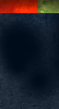
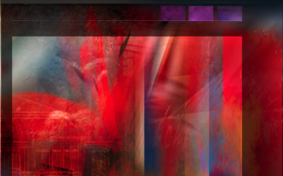
When large areas of empty space enter your layout, a simple gradient can be much more effective than just a solid color. As you see below, a subtle gradient added to these simple colors can add quite a bit of interest.

To arrive at just the right gradient, try applying the gradient as a layer effect. This will allow you to test different colors and tweak the ramp very quickly. When you arrive at one you like, but want to try another, copy the layer and adjust the new one. This keeps the old option intact, should you want to go back to it. Save your favorite gradients or save the layer effect for future designs.
Keeping the Perfect Digital Colors
When working on a commercial art project, it is not unusual to receive change requests from the client. It is also not unusual to receive a new project based on an old one, months or even years later. The challenge that often arises; how to paint new areas with the exact same color mix from before. Photoshop and Painter will let you save color swatches in palettes. This may not work very well for two reasons. First, the swatch file is a separate file that must be saved and stored with each piece of art. Secondly, brushes will often mix two colors, and you may not remember which two colors from the swatches were used for each mix. A little trick, is to save the colors samples on their own layer within the artwork itself.

Saving each color used in the artwork provides an easy reference, even years after the piece was created. Group or name the color layers with a standard system that enables easy reference to color mixes and their location in the artwork. Changing areas within the art are easy with the perfect color match. The color groupings can also be handy for creating a new piece of artwork with a similar or matching color scheme.


