


Power of the Rendered Plan
I recently created a set of architectural illustrations for a multifamily residential project. They represented various aspects of the rather large development. Among the goals the builder wanted to accomplish on this Italian style design were some marketing concepts of the rear courtyards on the townhomes.
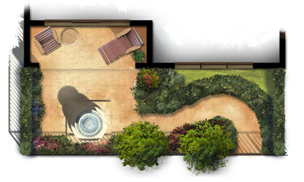
Small and simple, the plans reflect the way the outdoor courtyard spaces become part of each home’s living space. Each provides a fountain and sitting area with some low maintenance landscaping for aesthetics as well as privacy.
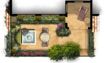
The artwork itself was created freehand in Photoshop using a variety of natural brushes. The landscaping plants themselves are loose and representational but suggest the colors and masses of possible garden ideas. The colors are bold and were carefully chosen to provide an eye catching marketing graphic for print as well as web presentation.
Rendering Architectural Elevations
I have created thousands of architectural illustrations, but in each and every one, I try to develop a new technique, explore new ways of using color, or learn something new. This not only keeps the work fresh and interesting, it allows me to grow as an artist and designer.

Creating a ragged edge around the rendered elevation is a technique I use frequently. At first glance it seems simple, but I spend more time on this than you might think. In effect, it creates a negative space in the artwork. Applied carefully, it will create balance, develop focal points, and enhance the motion in the piece.

Blobs of people shaped objects create life and activity while suggesting the scale of the architecture. The lack of detail keeps the focus on the architecture and not on specific characteristics of the people.

Framing a focal point with foreground landscaping will define the artwork’s motion and draw the visitors eye to the main architectural feature. The splash of color in the flowers create a sense of elegance while developing a contrast with the rustic stone.

Depth can be created with lighter colors in the background trees, this is a well known technique. It can also add depth in the foreground, visible in the walkway as it extends towards the viewer. Keep painting and enjoy the experience of trying something new each and every time!
Using Artwork to Achieve Goals
I just had to create a post today, February 29, Leap Day. This opportunity will not come along for another four years! Opportunities are important, and creating specific artwork to accomplish particular goals is always a great opportunity. If you have worked in architecture, you know change is a big part of the vocabulary. I recently had the opportunity to create some project artwork for the second time, the first being created over a year ago. The scope of the project had completely changed since the first renderings. The architect had all new designs. But more importantly, the client had very specific needs.

The review committees as well as people in the community, were very interested in the overall design of the project and how it would impact the streetscape and also the local foot traffic. The landscape architect had spent quite a bit of time designing pedestrian spaces and landscaping to screen the building masses from the roadway. The goal of the artwork was to represent the landscape buffer and show the pedestrian friendly design, while still showing the architectural style of the project. This was a challenge because the landscaping would literally hide the building behind.

My strategy for the artwork revealed itself in several steps. The first was to select a view from the road which was the most relevant to the end viewers and decision makers. The second was to feature one of the major pedestrian spaces in the foreground, creating a warm pedestrian friendly feeling. The most difficult aspect was the landscaping. I showed the most prominent trees and hedges to maintain accuracy with the landscape design. Then I carefully filled in just enough plant material to create the impression of the final landscaping while still allowing the most detailed building features to show through.

The end result was met with very positive reaction. The designers were pleased with the representations of their designs, and the community was quite satisfied with the proposed appearance, and how the design would impact their neighborhood. A creative use of artwork: goals achieved!
Art Composition of Long Architecture
When creating architectural renderings of designs that feature geometry long in the horizontal direction and short vertically, composition can be an issue. The traditional idea is to show the front of the subject, but this can create a long, short proportion to the final artwork.

To keep a more normal canvas proportion, this piece take advantage of a short vanishing point in the perspective. Even though the far residences are not quite as visible, the depth adds a level of interest to the composition and keeps the artwork a more manageable size.
Suggesting Geometry with Shadow
When illustrating architecture, important elements may sometimes not be as visible as desired. This vignette of a larger work shows the trellis that occurs above the entrance drive. The posts are obviously visible as well as the ends of the trellis, but those features do not create the ambiance of the space.

The answer is to illustrate the trellis and the space it defines by introducing the shadows cast by the geometry. Even though the trellis members are not visible, the shadows create their existence in the viewer’s mind. Using a little creativity with the shadows you can also enhance the perspective by defining the locations of nearby surfaces.
Architectural Illustration and the Metal Roof
One of the challenges of architectural illustration, is the representation of the many finish materials used in construction. Couple that with the complexities of natural atmosphere, sun, sky radiance, weathering of materials, and landscaping, and you have an even bigger challenge. Perhaps one of the most difficult materials to render is the silver colored standing seam metal roof.

There are several tricks that can prove to be very helpful. Do not use a silver or gray color, use a very desaturated blue. This will emulate the blue radiance from the sky. Constantly vary the color from dark to light, this will develop the matte reflection in the material. Copy and mirror architectural elements such as gables onto the metal and reduce the opacity to create subtle reflections. Lastly, paint dark seams next to lighter sections of the roof, and light seams next to the dark sections of roof. In the end, it takes a lot variation between light and dark, in just the right places, to make it work. Engaging in real world study of metal roofs under different lighting conditions will help you understand the subtleties of the material in your mind. So just have fun, experiment, and paint some metal!
Graphic Repetition to Create Depth
Not too long ago I was engaged to create a concept design for a very large ocean side resort. To complete the artwork, I soon realized the large pool and amenity area, which was not part of the project, would be visible in the foreground. “Come up with something” was the client’s response, so with little to go on, I quickly created this concept.


Graphically, one of the techniques I used to help show the changes in elevation, the turns in the landscape, and the distance from camera, was to use a repeated object. In this case, the repeated object is the lounge chair. As the viewer’s eye moves around the artwork, the different sizes and positions of the chair help delineate the landscape.
Multiple Layer Masks in Photoshop
Occasionally when creating a complex illustration, it is helpful to have options when hiding portions of a layer. To consistently use nondestructive editing, a single layer mask can be a little restrictive. For example, what if you have used a layer mask to create the outline of a shrub in the landscape, and a portion of it lies behind a column?

The answer is to use a second layer mask even though Photoshop only allows one per layer. Place the shrub layer inside of a group. A layer mask can then be applied to the group, allowing the option of a second mask. A section of the shrub can be removed without destroying the mask defining the shrub itself. Groups can be nested within groups, creating the option of several masks per layer.
Symmetry, Simplicity, Art, Design
Alone, iconic, and symmetrical, the design calls for a landscape feature at the center of a round about. As it will be seen from all sides, it must be the same on all sides. Themed and representative, the style must accentuate the identity while not being obtrusive. It must be highly visible while not blocking any views. The design answer is symmetrical and simple.

Like the design, the illustration portrays the same simplicity. Only a hint of background and a grass line foreground, suggest the environment but do not detract from the focus. The spray and fall of water provide compositional balance between the landscape’s features. The color palette is simple and light so as not to be a part of the design presentation.
When the design question calls for a simple answer, keep it simple. When the design is simple, quiet elegant artwork will keep the focus where it belongs: on the design. Symmetry between design and the representational artwork is a very, very effective strategy.
Dramatic Environment in Illustration
When creating architectural illustration, a more dramatic environment will add some excitement to the work. Rain or snow can be used for extreme effect, but simply making the time of day early evening can be quite dramatic. Dusk can be especially effective; a brighter sky and long shadows will add a lot of contrast to the rendering.

This illustration, the base of a high rise hotel in Scotland, has a unique but simple elevation. Using early evening as the time of day, details are still visible, lamps are turned on, light is projecting up the stone exterior, and shadows bring out the movement in the elevation.
The Color of Landscaping
In an architectural rendering, using bold colors that complement the colors of the building can make a dramatic impact on the presentation.

In this example, the seasonal blooms on the Royal Poinciana turn a very basic illustration into a very striking and vibrant one.

Illustrating an Isolated Subject
When designing and illustrating an isolated subject, it is not necessary, and possibly distracting to render the surrounding area. Simply suggesting a background and foreground can really make the subject stand out.

Abstractly edging the illustration, creating a vignette, can further simplify the graphic. The sketched white overlay on the background and side landscaping saved a lot of rendering time as well as creating a unique border around the subject.


