


Banjo, Music, and Art
Music has always been an important part of my life. Playing music seems to be a part of my family. My dad, uncles, brothers, sons, nephews all play guitar. I remember taking my first guitar lesson when I was about six years old, and later I played in a band throughout high school and college.
Some of my best memories, however, were the improv jam sessions my family would have on sunny Saturday afternoons on my Grandfather’s back porch. The music was all acoustic, typically bluegrass, which was a big departure from the good old rock n roll I normally played. My Dad and my uncle were amazing musicians and kind of led the song direction.
One day my Dad came home with a beat up old banjo, and with a big grin, handed it to me. I just returned his gaze with a quizzical look, and he just said “For Saturday!” I lived with that banjo for a week to learn a passable Foggy Mountain Breakdown. The back porch jam session arrived, and I surprised everyone with the banjo, and we played a rousing verse of what I had learned. Upon reaching the end of the tune, my uncle excitedly asked “What else do you know?” I replied “That’s it!” I think we played the same song for four straight hours, but man, we had a day to remember.

Afterwards, that banjo went into storage, and was forgotten. But over the years, I always wanted to learn the banjo, and about a year and a half ago I bought a new one. I have had a lot of fun learning to play, so much so, that I decided to feature a banjo in a painting. The banjo in the painting is a creation from my own imagination. The artwork is a mixture of my love for music, the banjo, and creating art.
“The Banjo” is available as various sized prints in my Etsy shop.
Painting the Vintage Santa Claus
It is hard to believe a whole year has passed since my last holiday tutorial on creating a stylized and shiny Christmas Tree in Photoshop. For this year, I have had some with a Santa Claus carrying his magical bag of toys.

Before starting to paint Santa, I did a little research on how artists have been portraying Santa. Unsurprisingly his appearance has evolved over the years, becoming ever more contemporary looking. Attracted to the Santa persona of years passed, I decided to make this one more of a vintage Santa Claus. I roughed in a sketch, creating a shorter, rounder Claus holding a very, very large bag of toys. To fill the color palette, I decided to use the colors of vintage Santa artwork circa 1900 to 1930. The reds and greens from that time period are very distinctive. The beard and fur colors have a definite yellowish tint, which not only “age” the vintage Santa, but adds a little warmth. The environment seems to be lit by the warm glow of a late night fire. Hope this gives you some ideas if you want to have some fun with holiday artwork of your own. Have a very Merry Christmas and a Happy New Year!
Santa is available in my shops on Etsy and Artfire.
Power of the Rendered Plan
I recently created a set of architectural illustrations for a multifamily residential project. They represented various aspects of the rather large development. Among the goals the builder wanted to accomplish on this Italian style design were some marketing concepts of the rear courtyards on the townhomes.
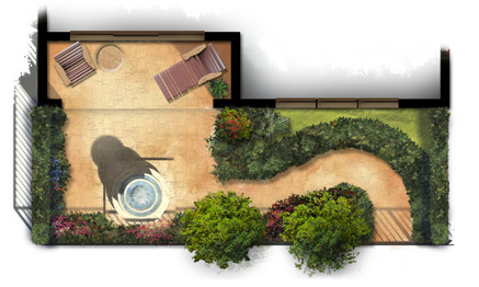
Small and simple, the plans reflect the way the outdoor courtyard spaces become part of each home’s living space. Each provides a fountain and sitting area with some low maintenance landscaping for aesthetics as well as privacy.
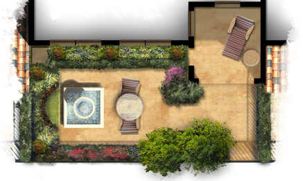
The artwork itself was created freehand in Photoshop using a variety of natural brushes. The landscaping plants themselves are loose and representational but suggest the colors and masses of possible garden ideas. The colors are bold and were carefully chosen to provide an eye catching marketing graphic for print as well as web presentation.
The Spirit of Halloween
There are several holidays that bring out the creative side in everyone. Halloween seems to be one of them. There is something about Halloween that fuels the imagination.

Catching the spirit, this art piece emerged from my imagination as a mixture of Halloween and the Fall season. It is available in my shops on Etsy and Artfire.
Rendering Architectural Elevations
I have created thousands of architectural illustrations, but in each and every one, I try to develop a new technique, explore new ways of using color, or learn something new. This not only keeps the work fresh and interesting, it allows me to grow as an artist and designer.

Creating a ragged edge around the rendered elevation is a technique I use frequently. At first glance it seems simple, but I spend more time on this than you might think. In effect, it creates a negative space in the artwork. Applied carefully, it will create balance, develop focal points, and enhance the motion in the piece.

Blobs of people shaped objects create life and activity while suggesting the scale of the architecture. The lack of detail keeps the focus on the architecture and not on specific characteristics of the people.

Framing a focal point with foreground landscaping will define the artwork’s motion and draw the visitors eye to the main architectural feature. The splash of color in the flowers create a sense of elegance while developing a contrast with the rustic stone.

Depth can be created with lighter colors in the background trees, this is a well known technique. It can also add depth in the foreground, visible in the walkway as it extends towards the viewer. Keep painting and enjoy the experience of trying something new each and every time!
Lighthouses and Artistic Expression
Recently I have been thinking about pursuing some of my own projects. I have on occasion done some quick sketches or abstract pieces to express myself as an artist, but I have not really presented them to public. Even though my main focus remains on commissioned work, I am going to be creating some other work, and making it available online. I have opened a shop on Etsy and another on Artfire.

One focus I am going to be exploring is a series on lighthouses. Lighthouses are an icon of our maritime past. They are unique in design, and the settings are always majestic. To that end, here are a couple of shots, above is the whole work and below is a closeup.

Another piece created for the shop is this humpback whale swimming leisurely through the sea. You can visit him at my Etsy shop here.

Environmental Impact in Architectural Art
The advantages of creating architectural concepts in 3d, include dimensional accuracy and authenticity of detail. The design presentation also requires, however, a few touches that warm the appearance and create an emotional connection to the sense of “place”. The best way to add these artistic connections is in the surrounding environment.

Nothing says home like the warm glow of lighting. Do not forget to add light fixtures, and then “turn them on” with a little glow. The warmth of lights inside the windows enhances the effect and also hints at activity inside the home. Some nice landscaping is obviously important, but little touches to the hardscape make it believable. Adding some stains to the sidewalk and some dirt to the brick pavers make the environment feel more natural. Finally a hint of a waterway with boats in the background, and a flowing fountain in the front create some life in an otherwise static environment.
Art Composition of Long Architecture
When creating architectural renderings of designs that feature geometry long in the horizontal direction and short vertically, composition can be an issue. The traditional idea is to show the front of the subject, but this can create a long, short proportion to the final artwork.

To keep a more normal canvas proportion, this piece take advantage of a short vanishing point in the perspective. Even though the far residences are not quite as visible, the depth adds a level of interest to the composition and keeps the artwork a more manageable size.
Suggesting Geometry with Shadow
When illustrating architecture, important elements may sometimes not be as visible as desired. This vignette of a larger work shows the trellis that occurs above the entrance drive. The posts are obviously visible as well as the ends of the trellis, but those features do not create the ambiance of the space.

The answer is to illustrate the trellis and the space it defines by introducing the shadows cast by the geometry. Even though the trellis members are not visible, the shadows create their existence in the viewer’s mind. Using a little creativity with the shadows you can also enhance the perspective by defining the locations of nearby surfaces.
Motion in Artwork
Creating a path in which the viewers eye will move can be done with color, texture or lines. It is a great way to center their focus when they look at your work. Red is always an immediate attention grabber and so are elements that are much brighter than the surrounding elements. Using them as the initial landing point is usually successful.

Once you establish the viewers landing point, path lines move the viewer’s eye where you want it to go. The lines can be actual lines such a s a road or walk. The path can also be created with landscaping, movement in the ground terrain, bright and dark variations, or the overall perspective of the piece. Placing a movement from the opposite direction, such as a stand of trees or some other opposing force will stop the eye movement at the focal point. A simple way to test your artwork’s movement is to close your eyes, open them quickly and see exactly where your own eye starts and stops. If your eye moves repeatedly in a similar path, you have been successful in creating a predictable motion in the piece. I chose this building rendering as an example because it has a very simplistic motion structure. Some have simple paths and some are much more complex and subtle, but motion is an important element in all of my work.
Adding Depth to a Rendered Elevation
A classic form of architectural illustration is the rendered 2D elevation. It can take on many forms: sketch, simple watercolor, marker, rough conceptual or detailed. If you really want to add just a little bit of life to the basic 2D elevation, make it a 2½ D elevation. By adding a little perspective to the foreground, and a little depth to the background, the artwork becomes a little more interesting.

Let’s start with the background. Create a little bit of sky to generate some atmosphere and establish the time of day. Next place a few trees or plants with slightly blurry detail behind the elevation. Then go for just a few more very blurry and lighter colored ones behind them. Voila! Instant depth.
The foreground is next. Flare the walk or a driveway with a little perspective and curve, and you immediately create foreground depth. A second touch just to finish the effect, enlarge the grass and the plants as they approach the bottom of the artwork. A little uneven vignette applied to them will add balance, edginess, and visual movement.
Architectural Illustration and the Metal Roof
One of the challenges of architectural illustration, is the representation of the many finish materials used in construction. Couple that with the complexities of natural atmosphere, sun, sky radiance, weathering of materials, and landscaping, and you have an even bigger challenge. Perhaps one of the most difficult materials to render is the silver colored standing seam metal roof.

There are several tricks that can prove to be very helpful. Do not use a silver or gray color, use a very desaturated blue. This will emulate the blue radiance from the sky. Constantly vary the color from dark to light, this will develop the matte reflection in the material. Copy and mirror architectural elements such as gables onto the metal and reduce the opacity to create subtle reflections. Lastly, paint dark seams next to lighter sections of the roof, and light seams next to the dark sections of roof. In the end, it takes a lot variation between light and dark, in just the right places, to make it work. Engaging in real world study of metal roofs under different lighting conditions will help you understand the subtleties of the material in your mind. So just have fun, experiment, and paint some metal!


