


Author Archive
Visit Me on Behance
I have recently joined the Behance Network which is a web community dedicated to creatives doing exciting work spanning all disciplines of art and design. I am thrilled to be part of it. It does create more exposure for my work, but, more importantly, I am finding the networking and resources with other artists to be both fun and informative.

The above link will take you directly to my profile, but while you are there, spend some time looking at other artist’s work as well. You will find some mind blowing artwork, brilliant photography, and incredible graphic design from all over the world.
The Newbie Axioms
One of the challenges I have run across when posting tutorials, is making the article valuable to all different skill levels. Posting a beginner topic is great for newbies, but may hold little interest for those more advanced. On the other hand, making the topic more advanced may baffle the beginners.
The other day, however, I gained a new perspective. Even though I consider myself an advanced user on certain things (Photoshop is my weapon of choice), I found myself a newbie in search of an answer to a basic question on something outside my realm of expertise. I took to the web, and found another newbie with my same question, asking for assistance on a blog forum. His question was met with, shall we say, less than a courteous response. That is when it dawned on me, there are at least two newbie axioms:
1. Every advanced user was once a newbie on the subject.
2 An advanced user in one area of expertise, can be a newbie in another.
So to you advanced users being asked for assistance from beginners, remember, you were a newbie once. Also, the newbie you address on your forum could be the expert on another. So be kind and patient when someone asks for your help. I guarantee it will be a rewarding experience for both of you.
Reading Kindle Books on iPhone
Being an avid reader, I guess it was only a matter of time until I jumped into Kindle. I did not actually get a Kindle though, I have been using the Kindle for iPhone App. My first thought was that the iPhone screen was too small, but it really has been just fine. The text is easy to read, there is just not a lot of text on each page.
You can browse for books online at your computer and sync the books to the iPhone, or just download books right to the iPhone. I have ordered most of my book selections so far with iPhone, it is quick and painless. Now for the best part – there is a nice selection of free books. The free selections are mostly classics, but they are still very fun to read!
Well, you will have to excuse me, I am halfway through a Sherlock Holmes adventure…
Creating Seamless Textures
I use textures very frequently in my work, and a very simple trick can make them a lot more useful. It is often advantageous to have the texture tile seamlessly. To put it simply, have the pattern repeat, but in a way that is not apparent to the viewer. Usually signs of a repetition appear at the pattern edges. By using the “Offset” filter, which is found in Photoshop under Filter | Other | Offset, you can shift the pattern so the edges are visible. Set the horizontal and vertical distances as appropriate for your image, and check the Wrap Around radio button. The pattern will shift revealing the edges.

Once the edges are visible, rub them out with a sampling of the pattern. Run the Offset filter again, and look for any edges you might have missed. Repeat this exercise until edge lines are no longer visible. While rubbing out the edges, pay close attention to any distinguishing features in the pattern that might jump out as the pattern repeats. These should be rubbed out as well.
The final step is to fill a large area in a test file with your new pattern. If you cannot see any obvious repetition, your new pattern is a success!
Photoshop Guides
With snap activated in Photoshop, guides and objects will automatically align with each other. This can be an extremely useful tool. To have guides align with a layer, set that layer to be the active one. Drag the guide in from the ruler bar and it will attach to the outer edges and center points of that layer. To snap a guide to a location that is not the edge of a layer, create a selection with the selection tool. The guide will snap to the outer edges of the selection, which is indicated by the “marching ants”. When dragging a layer near another one, if you are moving slowly, they will snap to each other.

The same snaps will also work with text. Text will align with the edges and centers of objects or guides. Conversely these same objects will snap to the edges and centers of text.
Photoshop Files in a Hurry
One of the features in Photoshop in which I really take advantage, is the use of layers, lots of layers. Anything that might need to be edited is placed on it’s own layer. Thus the file size can get to be quite large, my files can range from 600mb to over 1gb. These large files can take quite a while to open, and if the only reason for opening the file is something simple like running a print, opening the layered file is not necessary.
Here is a short but very handy tip. Click FILE then click OPEN as usual. Find the file in the dialog box and highlight it with the cursor. Then holding down the Alt and Shift keys simultaneously, click on the OPEN button. A dialog box will pop up asking “Read the composite data instead?” Click YES and the file will open with all layers flattened. The time required to open the file is shortened dramatically. The layering is still intact on the original file, you are not altering it in any way. But a word of caution, do not save this version over the original or you will lose all your layering.
I use this option quite often and it saves a tremendous amount of time. Think of it next time you need to quickly send a small proof to your client!
Learning Skills: Art and Design
I have always felt that there are three sides to improving art skills or design skills. The first objective, the “Creative” side, seems to be inherited to some extent, but there are many techniques and exercises to improve creative thinking. Keep in mind, even the most creative minds hit blocks now and then. They must overcome their “blocks” as everyone does. Exercises in creative thinking are varied and sometimes kind of crazy, but usually fun!
Secondly there is “Technical Expertise”. Whether you are painting with traditional watercolors, painting digitally in Photoshop, or laying out a website in Dreamweaver, there are skills that must be learned in order to create your vision effectively. By mastering the needed skills, you can concentrate more on realizing your creative vision, and less time figuring out how to accomplish the task. Many tutorials and learning materials seem to concentrate on technical expertise. They are usually fun, but often are oversimplified. Paint this here, and draw this here, now run a curves layer and set opacity to 20%… This will help you create the particular assignment, but a huge ingredient is missing. That ingredient is: Why do you do this?
Which brings up the third objective, and to me the most important one. That would be “Theory”. Theory is the underlying knowledge of art and design. Why does glass look the way it does? Why do shadows fall the way they do? Why do colors contrast differently when placed side by side? What effects do grids have on composition? How could Seurat paint detailed paintings with nothing but strategically placed colored dots? Why is that building proportionally challenged? What color is a cloud? How does light reflect when it hits water?
My mind is racing with these questions constantly. Many can just be answered by observing the world around you. Learn to not only look at the world, but actually see it. You will get some strange looks from people when they see you staring at a rock, but I guarantee they will not understand it’s texture, color, specular highlights, shadow intensities, or it’s complexity of shape. But how can you represent one, if you do not know these details?
Another great place to look for insights into theory would be the work of other artists. Look at famous artists, of course, but also look at the work of contemporary artists. The exercise I generally employ is to observe as much art as possible from many sources. When a piece of work jumps out at me, and makes me say “Wow!” as soon as I see it, I stop and analyze the piece to see what impresses me about the work. Is it composition? Is it color? Is it texture? Why do I like it? Why, why, why?
Only by exposing ourselves to new experiences and learning from them can we grow as artists. Look at the details and try to understand the theories that make them all work. With theory and technique in your grasp, your creativity can run wild.
CSS, Fun, and Modern Browsers
Even though my business offers different services: concept design, art & illustration, and web design – it seems incoming projects will undoubtedly be for the same service at any particular time. For the last couple of months almost everything has been web design.
Thus, web design is on my mind right now. One of the projects on which I have been working, is a redesign of my blog and resource Art & Architecture. Since it is a project for myself, I have decided to design it for a minimum screen resolution of 1024 pixels wide. It looks better on a 1280×1024 resolution, and even better on the 1920×1200 resolution running on my monitor. I have taken some time to play with enhancements using the Spry Framework in Adobe Dreamweaver. I have also been messing around with jQuery. Both offer some very cool possibilities.
The content for all current projects is database driven with structural html markup, and styled with css; no tables. I have been improving my web programming skills by dropping hard earned money on reference books, and doing lots of research on the web, and one thing confuses me a little. I vowed to keep everything positive on this blog, but a little rant here, the “expert” programmers writing these references spend a lot of time talking about designing for people with ultra low res monitors, and how to create work-arounds for people using ten year old outdated browsers. The first thought that comes to my mind, why is anyone using Internet Explorer 5 for Mac? There are any number of browsers available, and they are all FREE!
So I have been testing my code on current browsers: Firefox, Safari, Opera, Flock, Avant, Maxthon, SeaMonkey, Chrome, and Internet Explorer 6, 7, 8. (If you are not using a current browser, here is your opportunity.) As I can only have one version of Internet Explorer on my system at one time, I use IE Tester for testing Explorer. Second rant for this post, as I write the code (as the “experts” instruct me), my pages work perfectly in everything except Internet Explorer 6, 7, 8. So the second stage of every page design seems to be butchering the code three different ways to get it to work in each of the three Microsoft products. And they write our operating system! Microsoft! Learn how to write a browser and quit holding back the web!
Enough said: I must dive back into a reference book and find a hack to make today’s web page work in Internet Explorer. Yeeha!
On Andrew Wyeth
I am very saddened to hear that Andrew Wyeth has passed away at the age of 91. He has long been one of my favorite artists. His most recognized work is probably “Christina’s World”, but two of my favorites are “Trodden Weed” and “Faraway”. Two books about him are presently in my library. The book “Andrew Wyeth: Memory and Magic” is a wonderful book about him, and “Andrew Wyeth: Autobiography” has an excellent collection of his artwork. I recommend them both. If you are not familiar with Andrew Wyeth, you can see his official website at AndrewWyeth.com. Some more of his beautiful work can be seen at the Museum Syndicate and on the site of Mr. Wyeth’s representative.
Painting in the Material World
One of the common tests used in a 3d renderer is a simple sphere demonstrating materials and lighting. I am going to use a similar test to illustrate some 2d concepts. The following graphic was painted completely in Photoshop. The total time was under five minutes.

Granted it is nothing special from an artistic point of view, but when you are enhancing a 3d render in Photoshop, it is very important to understand what makes your 2d objects blend seamlessly with the render. Shadows are obvious of course, but never use black. I always like to use a darker, complementary color to make it pop. Use a blur filter to match the edges produced in the render.
Always remember to add specular highlights, they will add an extra bit of realism to your object. Then sample colors from the surrounding areas, and with a reduced brush opacity add some color to adjacent surfaces on your object. This will give the illusion that light is being reflected from surrounding objects. The next step is to copy merge adjacent areas and paste onto your object to add possible reflections. This step will depend on your material properties.
Finally, tint the whole object as required to make it look like it was rendered with the same light source. For example, if your render’s light source simulates dusk, you may need to tint your object with a little purple or blue.
This may seem like a lot of steps for each object in your rendering, but practice will enable you to do it quickly. The result will be added realism to your work. Practice with a simple sphere, and study how all of the material properties come into play within different environments. You may also find this knowledge will help you with your material development within the renderer.
Quick Brush Selection in Painter
When using Painter, the media and brush selector appear in the upper right hand corner of the screen. Selecting different brushes using this palette can be a little inconvenient. A quicker method, which does not interrupt your work flow, is to right click your input device. This calls up an onscreen display of all brushes in the current category. When creativity is flowing, easier brush selection can make a huge difference in your work.
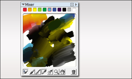
Finding a Natural Green
When painting your own plants, it can sometimes be difficult finding the right color of green. I use several methods for selecting colors. One is to use the mixer palette in Painter. The palette shown below exhibits a whole array of great natural greens, and I never used green in the mix. Most of the greens were established by mixing black and yellow. Then around the edges, I mixed in some cyan and blue. To get some red for flowers, I then mixed in a little red and orange. The additive colors were all chosen from the basic colors shown at the top of the mixer.
Here is a bush I painted in Photoshop using only the colors from the mixer palette. As you can see, I will often place some background colors behind the plant as I paint just to see how it will display against various background colors in the final painting.

The final test is placing it in a few renderings to see if it blends well. If needed, I will make some highlight /shadow adjustments to finish of the plant before placing it in my library.


