


Finding a Natural Green
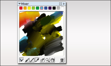
When painting your own plants, it can sometimes be difficult finding the right color of green. I use several methods for selecting colors. One is to use the mixer palette in Painter. The palette shown below exhibits a whole array of great natural greens, and I never used green in the mix. Most of the greens were established by mixing black and yellow. Then around the edges, I mixed in some cyan and blue. To get some red for flowers, I then mixed in a little red and orange. The additive colors were all chosen from the basic colors shown at the top of the mixer.
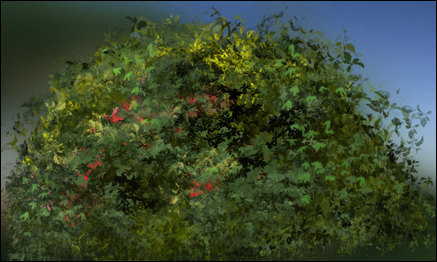
Here is a bush I painted in Photoshop using only the colors from the mixer palette. As you can see, I will often place some background colors behind the plant as I paint just to see how it will display against various background colors in the final painting.
The final test is placing it in a few renderings to see if it blends well. If needed, I will make some highlight /shadow adjustments to finish of the plant before placing it in my library.
Considerations when Rendering Green
For those of us doing architectural visualization, our libraries of plant materials are very important. As I have mentioned before, I create my own plant materials, but it is how they are blended into the rendering that is important.
One very important aspect to consider, is the color of green we use in our plants. If using from your library, adjust contrast and shadow to make the plant blend with the surroundings. Then, adjust the color with a color overlay or a curves adjustment layer.

In this example, I adjusted the palm color with a curves layer to make it blend with the early evening sky. I also added some highlights and shadows to the fronds with some sampled colors.


